
It’s everything down to the little things that make a difference between an amateur and professional.
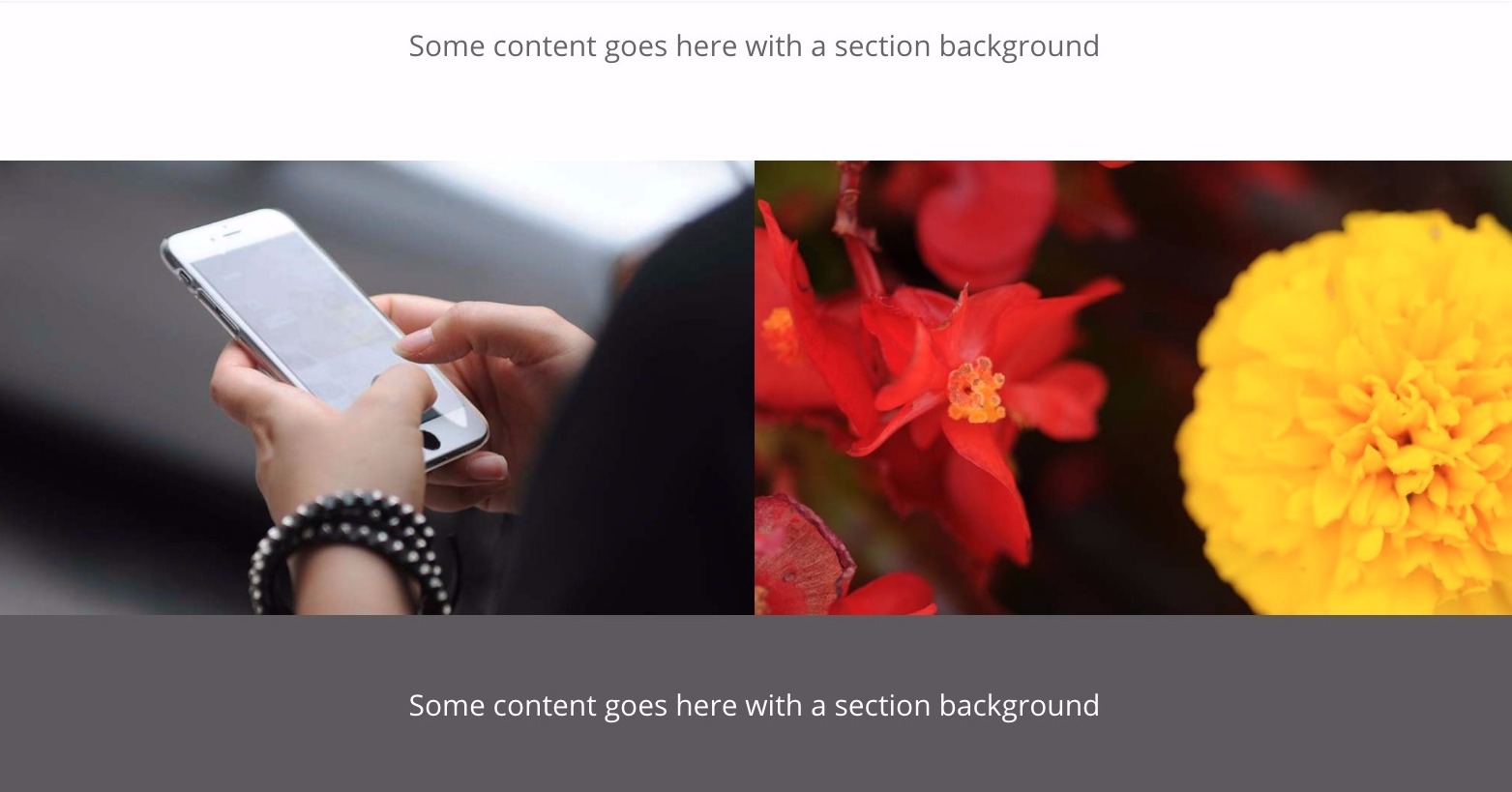
One of those little things is the double column images.
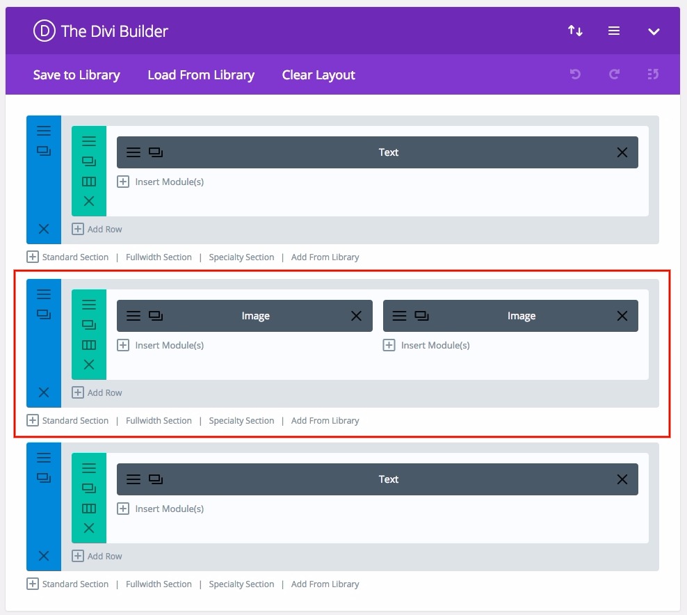
Here’s an example:
First, here’s how to do it.
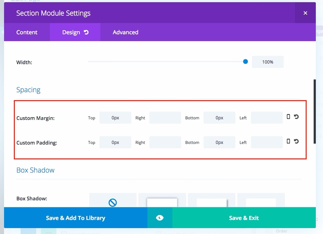
Section
– margin: top 0, bottom 0
– padding: top 0, bottom 0
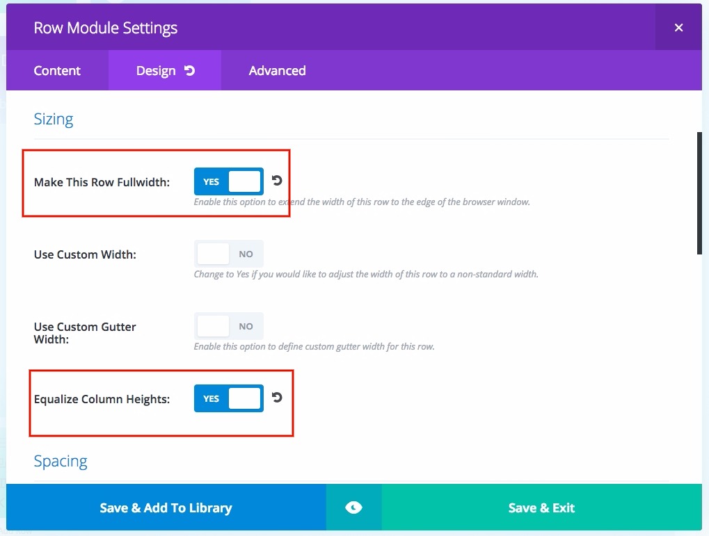
Rows
– columns: 2
– full width: yup
– Equalize column heights: yup
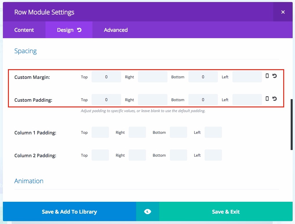
– margin: top 0, bottom 0
– padding: top 0, bottom 0
Now, a really important point to remember is that you have to make sure you cut both image out of the same template.
This means, make a blank file of a certain ratio (such as 1000×600) in an image editing app, like Photoshop, and paste images as layers on top, scale the layers how you want, and export the different instances of the images. This is to ensure that all the images are pixel perfectly identical in size.
(This is important because simply scaling the images to be the same size can result in fractional pixels in the size without you knowing it, and it causes problems later.)
So, now you upload two images in its respective columns and tada! a nice double image full width row.
But here’s the problem.
Sometimes, when the user is resizing the browser, you encounter a sliver of white.
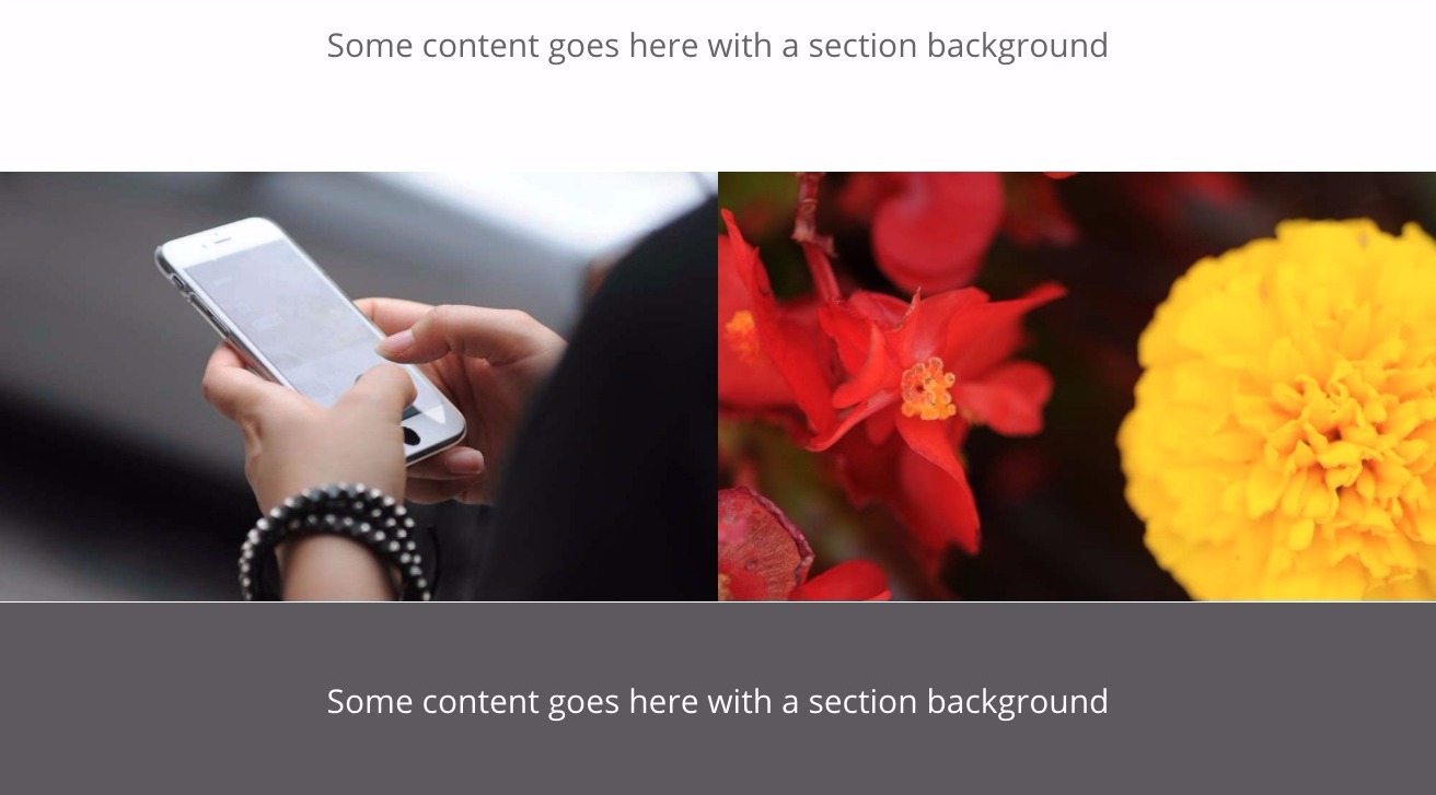
Yes, this happens quite more often than you’d think.
The reason this happens is because in full width mode, the images need to keep their ratios while filling the width of the screen. This results in the calculations not being rounded up properly and we get very small half pixel lines.
This is less than ideal.
And it’s not like I can just NOT use that layout.
So here’s the solution.
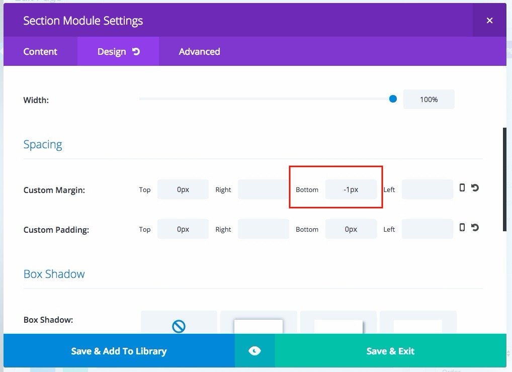
Make the top or bottom margin -1px.
Really simple way of fixing this without adding extra calculations.


Anonymous says:
5