Responsive Web Typography Crash Course
Here’s the quickest way to make your web typography responsive… without using any media queries! WHAT?!?
Here’s the quickest way to make your web typography responsive… without using any media queries! WHAT?!?
After years of making highly responsive Divi websites, here’s a rundown of my solutions to the most common responsiveness questions concerning Divi I’ve seen on the web. (Web meaning Facebook groups.) Buckle up, this one’s (long and) comprehensive This post isn’t a single “tutorial” per se, but more like a summary of everything you need, […]
Here’s a simple method you can use to reorder mobile stacking. The main problem with using page builders and its settings is that you’re stuck with what the developer allows you to do. Divi in this case, is quite limited in its responsiveness, which is why I made a whole course on how to make […]
The Preview / Inspiration Hey guys, so Elegant Themes recently redesigned their website. I quite liked it. One thing really caught my eye. This part: It looks really nice, but the best part is when your mouse hovers over it. That looks pretty good! On mobile we get a 2 column layout. So now I […]
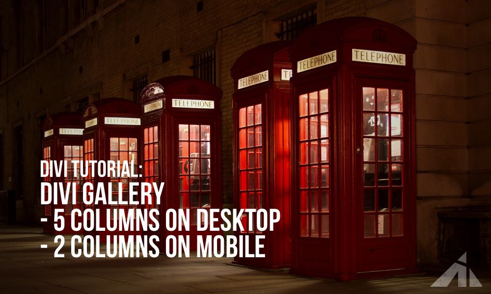
This article will be about styling the Divi Gallery module. By default, the Divi Gallery has 4 columns on desktop and 1 column on mobile. But in this tutorial, we will make it have 5 columns on desktop and 2 on mobile. We will achieve this by using some custom CSS code. The first thing […]