![[CSS] Responsive Line Breaks](https://almostinevitable.com/wp-content/uploads/2017/12/feat-the-line-break.jpg)
Hi. So mobile. Getting your content to look good is… important.
But sometimes yo
u run into probl
ems that are rea
lly frustrating.
Yeah, line breaks are hard to take control of when left on its own.
You can try a couple of different solutions:
1. Make a whole new module (if you’re using a page builder) or section that will load differently on different devices.
– Pros: Relatively easy to do. (Most page builders allow you to just check a device on/off, so just clone a module and click away)
– Cons: Sometimes the responsiveness can become unruly when whole modules switch out. Once you start caring about line breaks on all devices (as you should, but there are way too many people who don’t), then this could become too limiting and frustrating real soon.
I found that the cons outweigh the pros in this case.
So.. something else.
Also, if you want to really fine-tune and be really nit-picky about the responsive behavior, it really shows that extra bit of designer OCD that puts you above the crowd.
2. This is what I like to do.
Let’s start with the page:
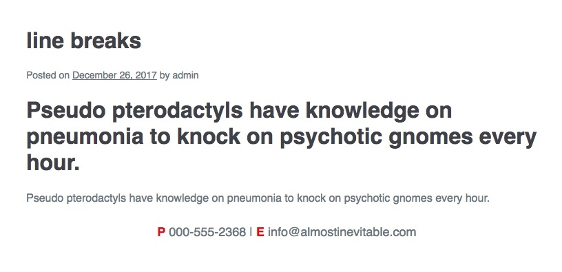
Here’s the html to start with.
<p style="text-align:center; font-size:18px;"><strong>P</strong> 000-555-2368 | <strong>E</strong> info@almostinevitable.com</p>
In case you were wondering how I got the P and E to be red without a span, it’s with this css:
p > strong {color: #d00;}
Anyways, so it looks wonky on mobile, as you can see here:

Here’s what we want:
– Hide the vertical bar on mobile
– Drop the E to the next line on mobile
We need to start with media queries…
Add the following CSS somewhere.
(customizer > additional CSS, or add to the child theme’s stylesheet)
@media all and (min-width:551px) {
    .desktop-br {display: inline;}
    .mobile-br {display: none;}
}
@media all and (max-width:550px) {
    .desktop-br {display: none;}
    .mobile-br {display: inline;}
}
[sc name=”customcss”]
What you did was define a class that will act like a regular character when screen width is under 551px, and disappear when it’s 551px and over. Also, another class to tag-team with it so there’s a switch-like behavior to the line breaks.
So let’s put those media queries to work!
STEP 1. Hide the vertical bar.
Here, we add a span around the bar. It’s pretty straightforward.
<span class="desktop-br">|</span>

STEP 2. drop the E by adding a responsive line break.
<span class="mobile-br"><br></span>
voila!

Now here’s a neat little tip: You can actually style a br element.
Like this:
<br class="mobile-br">
Here’s the full line in case you want to check it out:
<p style="text-align:center; font-size:18px;"><strong>P</strong> 000-555-2368 <span class="desktop-br">|</span> <br class="mobile-br"><strong>E</strong> info@almostinevitable.com</p>
That’s it. Just the br with a class, and it’s a responsive line break. Pretty neat, huh?
This means that from now on, you can actually control all your line breaks!
Have fun with this newfound power!
[sc name=”learn css”]
[sc name=”responsive-ad”]
[sc name=”podcast”]
Photo by Jeremy Bishop on Unsplash


Dawn Sparks says:
Hi, So I have a question about line breaks. I’m a copywriter and write for a lot of website design clients. One designer I work with tells me “If you want to have those words on their own, we would have to introduce line breaks. This can look bad on different screen sizes and typically advise against this style of text formatting.”. Is there no way around this? Sometimes, you want the first or last line of copy to start or end with a certain word for emotional impact or clarity. This is super frustrating. Any advice?
PK says:
Hi Dawn, I agree, unruly line breaks can be ugly.
This post is about being able to manage line breaks depending on screen sizes, and it works pretty well.
Let me know if you have any trouble implementing it!
Matt says:
This worked perfectly for my site.
Thanks
PK says:
Mi Matt, Thanks, Happy to help!
theresa says:
Thank you for sharing this! I had been doing it a different way but it wasn’t working and this is much cleaner. Works great in Squarespace!
PK says:
Hi Theresa, thank you for the kind words.
Luckily, this is a HTML+CSS solution, so it works well on almost every platform. Happy to hear this tut helped!
Anonymous says:
4.5
Anonymous says:
5