I’m actually pretty happy with this one.
The main problem with making this in Divi is the HTML structure.
Usually, if you want to superimpose a layer on top of an image, you’re going to need two distinct divs and give them absolute positioning.
But the Divi blog module doesn’t have this. All the elements are just child elements on the same level.
A few different options to overcome this:
– Make a new blog module -> just for that? whew..
– Edit the parent theme blog module -> You’ll have to do it for every update, so probably not a good idea.
– Use jquery to add some extra HTML -> Not the best tool for the problem. Plus, it can get hard to maintain.
So.. here’s a pure CSS method. woohoo!
Preview
Here’s what we’re going for:
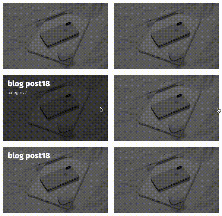
Or just watch the video below:
The Video
What you need to do
Add a blog module.
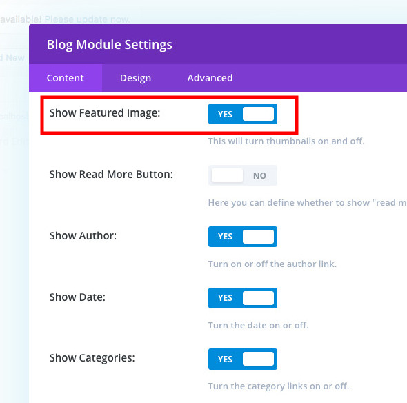
Make sure you have the featured image ON.
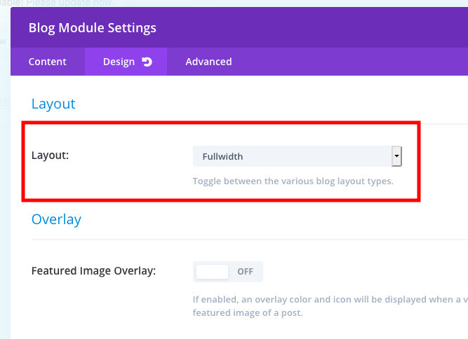
Layout – Fullwidth
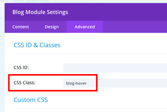
Custom Class: blog-hover
The CSS
And then add this CSS
.et_pb_posts.blog-hover .et_pb_ajax_pagination_container {
  display: -webkit-box;
  display: -ms-flexbox;
  display: flex;
  -webkit-box-pack: start;
      -ms-flex-pack: start;
          justify-content: flex-start;
  -ms-flex-wrap: wrap;
      flex-wrap: wrap;
}
.et_pb_posts.blog-hover .et_pb_ajax_pagination_container .et_pb_post {
  width: calc(33% - .5rem);
  margin-right: .95rem;
  margin-bottom: 1rem;
  position: relative;
  overflow: hidden;
}
.et_pb_posts.blog-hover .et_pb_ajax_pagination_container .et_pb_post:nth-child(3n+3) {
  margin-right: 0;
}
.et_pb_posts.blog-hover .et_pb_ajax_pagination_container .et_pb_post:after {
  content: "";
  position: absolute;
  visibility: visible;
  left: 0;
  top: 0;
  width: 0;
  height: 100%;
  background: rgba(0, 0, 0, 0.4); /* this is the color of the overlay */
  z-index: 1;
}
.et_pb_posts.blog-hover .et_pb_ajax_pagination_container .et_pb_post .entry-featured-image-url {
  margin-bottom: 0;
}
.et_pb_posts.blog-hover .et_pb_ajax_pagination_container .et_pb_post .entry-title {
  position: absolute;
  color: white; /* this is the color of the title text. You can take this out to modify it in the module settings */
  top: 1rem;
  left: 1.5rem;
  opacity: 0;
  z-index: 2;
  -webkit-transition: all 0.5s ease-in-out;
  transition: all 0.5s ease-in-out;
}
.et_pb_posts.blog-hover .et_pb_ajax_pagination_container .et_pb_post .post-meta {
  position: absolute;
  top: 3rem;
  left: 1.5rem;
  opacity: 0;
  z-index: 2;
  -webkit-transition: all 0.5s ease-in-out;
  transition: all 0.5s ease-in-out;
}
.et_pb_posts.blog-hover .et_pb_ajax_pagination_container .et_pb_post .post-content {
  display: none;
}
.et_pb_posts.blog-hover .et_pb_ajax_pagination_container .et_pb_post:hover:after {
  width: 100%;
  -webkit-transition: all 0.5s ease-in-out;
  transition: all 0.5s ease-in-out;
}
.et_pb_posts.blog-hover .et_pb_ajax_pagination_container .et_pb_post:hover .entry-title {
  top: 1rem;
  left: 1rem;
  opacity: 1;
  -webkit-transition: all 0.5s ease-in-out;
  transition: all 0.5s ease-in-out;
}
.et_pb_posts.blog-hover .et_pb_ajax_pagination_container .et_pb_post:hover .post-meta {
  top: 3rem;
  left: 1rem;
  opacity: 1;
  -webkit-transition: all 0.5s ease-in-out;
  transition: all 0.5s ease-in-out;
}
.et_pb_posts.blog-hover .et_pb_ajax_pagination_container .et_pb_post:hover .post-meta a {
  color: white; /* this is the color of the post meta. You can take this out to modify it in the module settings */
}
@media all and (max-width: 1024px) {
  .et_pb_posts.blog-hover .et_pb_ajax_pagination_container .et_pb_post:hover {
    margin-bottom: 2rem;
  }
  .et_pb_posts.blog-hover .et_pb_ajax_pagination_container .et_pb_post:hover:after {
    display: none;
    -webkit-transition: all 0.5s ease-in-out;
    transition: all 0.5s ease-in-out;
  }
  .et_pb_posts.blog-hover .et_pb_ajax_pagination_container .et_pb_post:hover .entry-title {
    position: relative;
    top: 1rem;
    left: 0;
    opacity: 1;
    color: black; /* this is the color of the title on mobile. You can take this out to modify it in the module settings */
    margin-bottom: 1rem;
    -webkit-transition: all 0.5s ease-in-out;
    transition: all 0.5s ease-in-out;
  }
  .et_pb_posts.blog-hover .et_pb_ajax_pagination_container .et_pb_post:hover .post-meta {
    position: relative;
    top: auto;
    left: 0;
    opacity: 1;
    -webkit-transition: all 0.5s ease-in-out;
    transition: all 0.5s ease-in-out;
  }
  .et_pb_posts.blog-hover .et_pb_ajax_pagination_container .et_pb_post:hover .post-meta a {
    color: black; /* this is the color of the post meta on mobile. You can take this out to modify it in the module settings */
  }
}
@media all and (max-width: 1024px) {
  .et_pb_posts.blog-hover .et_pb_ajax_pagination_container .et_pb_post {
    margin-bottom: 2rem;
  }
  .et_pb_posts.blog-hover .et_pb_ajax_pagination_container .et_pb_post:after {
    display: none;
    -webkit-transition: all 0.5s ease-in-out;
    transition: all 0.5s ease-in-out;
  }
  .et_pb_posts.blog-hover .et_pb_ajax_pagination_container .et_pb_post .entry-title {
    position: relative;
    top: 1rem;
    left: 0;
    opacity: 1;
    color: black;
    margin-bottom: 1rem;
    -webkit-transition: all 0.5s ease-in-out;
    transition: all 0.5s ease-in-out;
  }
  .et_pb_posts.blog-hover .et_pb_ajax_pagination_container .et_pb_post .post-meta {
    position: relative;
    top: auto;
    left: 0;
    opacity: 1;
    color: black;
    -webkit-transition: all 0.5s ease-in-out;
    transition: all 0.5s ease-in-out;
  }
  .et_pb_posts.blog-hover .et_pb_ajax_pagination_container .et_pb_post .post-meta a {
    color: black;
  }
}
@media all and (max-width: 980px) {
  .et_pb_posts.blog-hover .et_pb_ajax_pagination_container .et_pb_post {
    width: calc(50% - 12.5px);
  }
  .et_pb_posts.blog-hover .et_pb_ajax_pagination_container .et_pb_post:nth-child(3n+2) {
    margin-right: 1rem;
  }
  .et_pb_posts.blog-hover .et_pb_ajax_pagination_container .et_pb_post:nth-child(odd) {
    margin-right: 1rem;
  }
  .et_pb_posts.blog-hover .et_pb_ajax_pagination_container .et_pb_post:nth-child(even) {
    margin-right: 0;
  }
}
@media all and (max-width: 479px) {
  .et_pb_posts.blog-hover .et_pb_ajax_pagination_container .et_pb_post {
    width: 100%;
    margin-right: 0 !important;
  }
}
[sc name=”customcss”]
And you’re DONE!
Note: if you want to hide the post meta and only use the title in the center of the block, add display: none; to all the post-meta rules and change the entry-title positioning like this:
.et_pb_posts.blog-hover .et_pb_ajax_pagination_container .et_pb_post:hover .entry-title {
  top: 50%;
  left: 50%;
  transform: translate(-50%, -50%);
  opacity: 1;
  -webkit-transition: all 0.5s ease-in-out;
  transition: all 0.5s ease-in-out;
}
[sc name=”learn css”]
[sc name=”responsive-ad”]
Photo by Jure Tufekcic on Unsplash



Sophia says:
Dear PK,
first thanks for the great tutorial, it works like a charm 🙂
Could you maybe give me a hint on what to do if the featured images I am using have different formats? Is there a way they all adapt to one size?
F4F says:
Had trouble defining the hit area to be the entire block. Other than that, very easy to follow, thanks!
PK says:
Thank you for the kind words!
Ajay Gupta says:
Is there any why we can add 4 post in each row code with your CSS setting.
PK says:
Hi Ajay, this sounds like a different problem, have a look at this post: http://almostinevitable.com/divi-styling-the-blog-module/
Thanks
Ajay Gupta says:
After Hover applied only the Post title is clickable not whole hover effect.is any CSS modification to solve this..
PK says:
Hi Ajay, yes, this is possible. You can stretch out the anchor tag area to fit the hover area.
I don’t have any Divi installation (I should, sorry) to test on at the moment. If you send me a URL I can look at, I’ll write up the extra code for you. feel free to email me at my name @ this domain. Thanks
Ajay Gupta says:
I am using your CSS on my site- https://www.ganti-associates.com/index.php/project/architecture/
PK says:
Oh cool, thanks!
here’s the extra code you need.
.et_pb_posts.blog-hover .et_pb_ajax_pagination_container .et_pb_post:hover .entry-title {
width: calc(100% – 2rem);
height: calc(100% – 2rem);
text-align: left !important; /* need to override Divi’s settings */
}
.et_pb_posts.blog-hover .et_pb_ajax_pagination_container .et_pb_post:hover .entry-title a {
display: block;
width: 100%;
height: 100%;
}
Alex Manning says:
I seem to have followed all the steps, downloaded the plugin, copied the CSS into the field etc, and activated the plugin and CSS, but on the page nothing has visually changed? Am I forgetting an obvious step or have I not used Custom CSS properly?
PK says:
Hi Alex, I think it could depend on how the blog archive section is built. Could you send through a URL via contact form (link in footer) so I can have a look?
Thanks
Spencer says:
Thanks so much for sharing. I’m new to DIvi / CSS and am trying to get my blog up and running. However, I’m getting stuck on a part of the CSS. When I add the code. It seems to appear when I go to the site but it does not show up at all in the Visual Builder. It typically wouldn’t be an issue, but the blog post isn’t appearing in the center of the page and it’s hard for me to figure out what’s going on when I can’t see it in visual builder.
Do you have any idea why that is?
PK says:
Hi Spencer,
I’m not exactly sure what’s going on, could you send me an email here http://almostinevitable.com/contact-me/ with a URL and some more detail? I’ll have a look.
thanks
thomas says:
HI PK, your awsome! My Customer wants additional to the title the excerpt and a icon (instead of read more or a button with 3 arrows) centered. How could i achieve this one? Thx for your help.
PK says:
Hi Thomas, thank you for the kind words. I suppose you could add icons and stuff, but from you wrote it sounds more like just a block that has this type of hover behavior. In that case, I made a different tutorial that looks similar using a blurb module here: http://almostinevitable.com/divi-adding-hover-overlay-to-the-blurb-module/
With a blurb module, you can just add what you want in the blurb content field. Hope that helps. Thanks
TESS says:
Thanks PK! Just what I was looking for 🙂
PK says:
Awesome! always happy to help!
Isla Sands says:
Hi there, I’m not a developer but I do try with my Divi themed website. I am currently working on a new Divi Child Theme. While under construction my website is down to a very basic Homepage Blog using Content Views. I want to start using the Divi Blog Module.
I have created a Blog Module page and added your CSS to enable an overlay with title in the centre. It all works perfectly except for 2 things:
1. The overlay drops below the post featured image instead of just covering it. For some reason when I made the blog module Full width instead of Grid all the featured images display as different sizes.
2. I followed instructions to remove meta data and just have the post Title in centre of overlay but clearly have done something wrong. Can I email you the page I am working on? The overlay is fantastic. If you are happy to take a look could I email you the page I am working on.
Thanks, Isla
PK says:
Hi Isla, yes please email me the page, and I’ll have a look!
http://almostinevitable.com/contact-me/