Hey guys, let’s learn how to transform a Divi blurb module into a cool mouse hover block.
Preface:
I do NOT like mouse hover actions on mobile devices. It makes no sense.
Also, I think it’s outdated, and the websites that still have it are just not modifying legacy behavior to fit the mobile scene.
Why? Because mobile device input is predominantly TAPPING.
Tap, tap, tap.
and swipe.
Swipe, tap.
There are now long-presses, 3D touches, and press-hold-drags, and stuff, but that’s about it. Those are all fundamentally tap+swipe-driven.
Nowhere in the smart phone interface is there a hover action.
The easiest way to realize this is to check smartphone OSes and all the apps. Go ahead, unlock your phone and look around. They don’t use hover states, do they?
For the record,
iPhones allow a half-assed slight-touch that triggers the hover state. Back in 2007, mouseovers were a bit more important than they are now..
Android does not. Android shows the hover state, but it doesn’t hold, it goes directly through to the link.
This means the hover state is also inconsistent in its behavior.
(For more reading on this issue, check out the reference links added at the bottom of this post.)
However, it IS pretty cool if it’s done well on desktop.
Oct. 4th UPDATE + PREFACE 2 : OK, so Divi has finally (and surprisingly quickly) delivered on their hover options which I think is pretty quick in their development speed (First sneak peeked on May 24th). So color me impressed. However, those hover options.. are clunky on mobile, and that’s… BAD… because mobile is worthy of consideration to say the least.
So.. when I make solutions, I make sure to think about how it’ll look on mobile, and I stand by that approach. So I think this post is still relevant since it has the mobile version covered as well.
Hey, you wanna learn more about mobile responsiveness?
Click me to check out a cool course on how to make Divi more responsive
[sc name=”responsive-ad”]
So… Let’s give this a try.
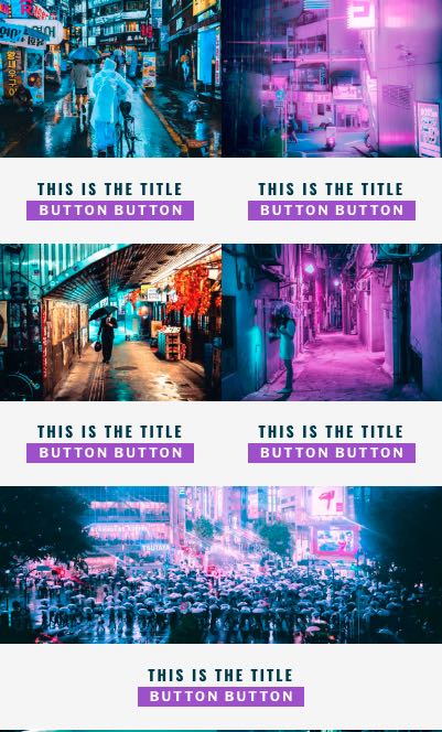
The desktop

On Mobile
The Video
The html structure
The reason why I chose the blurb module to get this done is because it has the right structure to have a hover panel turn up.
What you need is something like this:
– > the whole container
– >> the image
– >> the content
We have to hide the content part with opacity: 0; and on mouse hover, change the opacity to 1.
We will also have to use absolute positioning.
Absolute positioning is not as scary as it sounds. Whichever element gets absolute positioning, it will position itself using the closest parent with relative position as the starting point. (This is different from fixed positioning, as fixed is FIXED on the screen.)
So in this case
– > the whole container -> relative
– >> the image -> absolute -> top: 0; left: 0; width: 100%; height: 100%;
– >> the content -> absolute -> top: 0; left: 0; width: 100%; height: 100%;
This means the two elements (image & content) will overlap, and the content element will be on top (because it comes after)
So, after styling the content block, we can proceed to make it invisible with opacity: 0;
The CSS should look something like this:
.theparent {
	position: relative;
}
.theparent .theimage {
	position: absolute;
	top: 0;
	left: 0;
	width: 100%;
	height: 100%;
}
.theparent .thetext {
	position: absolute;
	top: 0;
	left: 0;
	width: 100%;
	height: 100%;
	opacity: 0;
}
and now we’ll learn how to change things around.
We’ll learn about getting fancy later, for now, this is the basic starting point.
The jquery hover
To get the hover to work, the :hover in CSS sounds like a really cool and easy way of getting it to work, but unfortunately, sometimes it doesn’t work the way we want it to, so I just decided to take the jquery route.
So let’s add some jquery.
Add this to the bottom of your functions.php file. (note: you can use a code module with a script tag in it, but why limit yourself to a single page?)
function universal_mouse_hover() {?>
<script>
jQuery(document).ready(function($){
    $( ".et_pb_module" ).hover(
    function() {
      $( this ).addClass( "beethoven" );
    }, function() {
      $( this ).removeClass( "beethoven" );
    }
  );
});
</script>
<?php
}
add_action( 'wp_footer', 'universal_mouse_hover');
Or if you really want to use the code module (I don’t see why you’d wanna do that, but oh well, just in case) copy this into a code module:
(OR, just add it to the theme integrations)
<script>
jQuery(document).ready(function($){
    $( ".et_pb_module" ).hover(
    function() {
      $( this ).addClass( "beethoven" );
    }, function() {
      $( this ).removeClass( "beethoven" );
    }
  );
});
</script>
Like this, if needed:
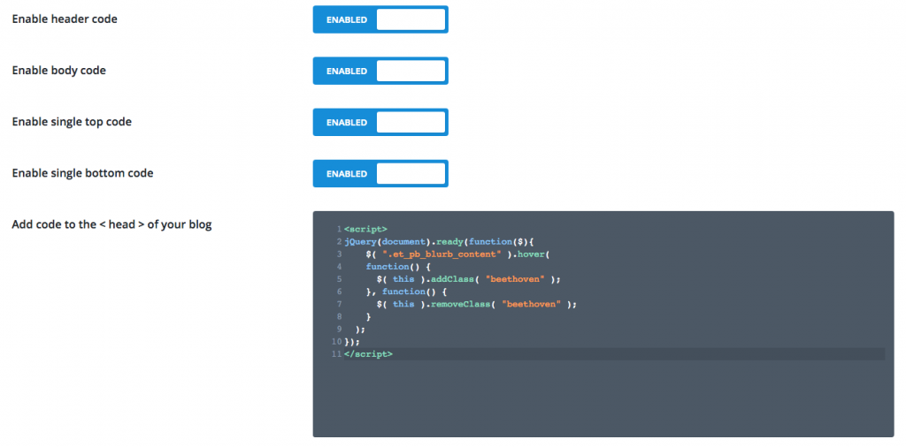
As you can see, the class beethoven will be added to any element with the class et_pb_module. So basically, whenever a mouse hovers on a module, a class will be added.
This means you can style it.
Something like this:
(NOTE: the example here is NOT the actual code, this is just a simplified version so you can understand it better)
.theparent .thetext.beethoven {
	opacity: 1;
}
The styling
Now for the CSS.
It’s quite long, so I’ll just add the file here:
I would use a child theme (get it here) and add it to the main.css file, and you’re done. 🙂
OR
You can add (copy/paste) the CSS into the theme option like this:
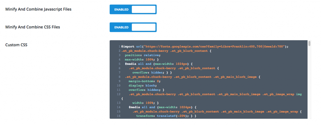
So here we go, just drop that in there, and just to help out, here’s a json file of the layout.
NOTE: the json file should be imported in the Divi library.
So, there you go. It’s pretty easy to get this up and running.
Make sure you get all three snippets.
The jquery code, the CSS, and the json file.
update: walkthrough video
Just in case you want the placeholder images:
Find his photos here:
https://unsplash.com/@steveroe_
AND, I’ll finish with this:
https://www.youtube.com/watch?v=sij1R6cjh4A
[sc name=”learn css”]
update
– updated the css file so it includes commenting for easy modification.
Photo by Alex Perez on Unsplash




Sam says:
Anyway to keep the title visible also, without rollover on the image?
friendorfoley says:
Thanks for this tutorial!
PK says:
Hi, thank you for the kind words, happy to help!
Chim says:
Hi PK, thanks for all. Juste 1 question (I’m a beginner), I would like to keep the title on the image (on the desk version) without rollover. How and where can I modify that in your code?
Thanks for your help!
PK says:
Hi thank you for the kind words!
In regards to your question, so you want to get the blurb module to just show the title over the image, and nothing happening on mousehover, right?
That’s actually easier as it doesn’t require jquery. I’ll come back to post it here or possibly a new tutorial. Stay tuned!
Chim says:
Hi!
I would like to keep that you did but I would like more the title in the center of the image without rollover. I don’t know if it’s clear 🙂
Thanks!
Chim says:
Thanks for your tuto ! It’s great!
rigid says:
Hey, this is amazing. it works well. I was able to customize colors to feet my needs. But i had some problems when switching to tablet or phone mode. The colors for these devices remains the original ones and that’s not good 🙂
I tried to change them manually but i messed up other features. Could you kindly give me some instructions on how to modify them?
Thanks man, you’re the best 🙂
PK says:
Hi, thank you for the kind words!
As for the colors and stuff, I have updated the css download file to include comment on the colors.
so the easiest way to fix things is to overwrite what you did with the new css file and look through the comments and change things to match your brand.
Hope this helps!
reed says:
I have been writing my own code from scratch(got into javascript a couple months ago), and had a major hangup and looked this up last night… i was ALMOST there, but THANK YOU FOR HAVING THE ANSWER!!!
PK says:
Hey Reed, thank you for the kind words. 🙂
Happy to help!
Erwann says:
Thank you very much for this ! I really appreciate your work, it solved one big problem for me.
Best regards from France.
PK says:
That’s great! Happy to of any help. Thank you for the kinds words