The Preview / Inspiration
Hey guys, so Elegant Themes recently redesigned their website. I quite liked it.
One thing really caught my eye. This part:
It looks really nice, but the best part is when your mouse hovers over it.

That looks pretty good!
On mobile we get a 2 column layout.

So now I need to think about how to make it work. The thing is, it’s not just building it that’s the task here. That part’s easy. If it’s for a build that I’m doing myself, I don’t have to worry about making it easy to follow, or easy to edit. I can just build it any way I’m comfortable with. (In this case, I’d use ACF to add the extra images so it’ll show up in the archive. Note: Advanced level courses are coming soon. SCSS and ACF) Anyways, so sticking the best I can with Divi’s modules and build, here’s my way of recreating that cool layout with Divi.
Some points to remember
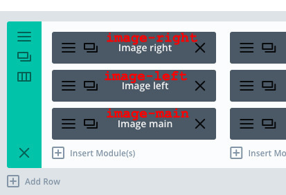
1. You will need three images on top of each other.
2. There’s a slight zoom when you hover.
3. It will be disabled on mobile (because.. hover doesn’t work on mobile)
The video
The build
Let’s start with the whole row.
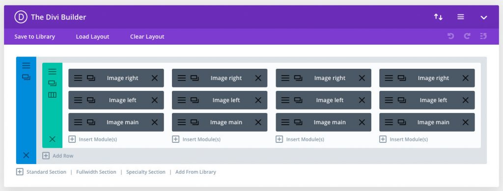
It’s the columns that will do the heavy lifting in this case, so go ahead and add three images modules per column.
The row and each column will have to take a custom class each.
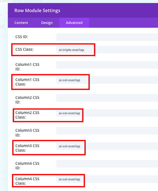
Finally, add custom classes to each of the modules
And you’re ready to rock and roll!
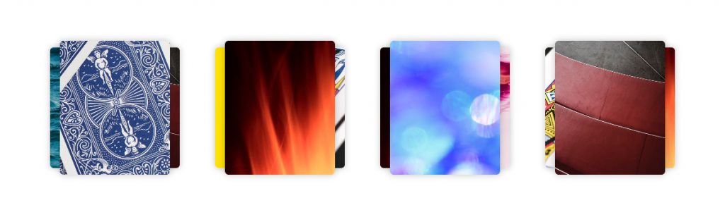
The images I used are 500×800, just so I could get a card-like look to the layout.
The code
What’s a good layout without the CSS?
Copy paste this snippet:
.et_pb_row.ai-triple-overlap {
  display: -webkit-box;
  display: -ms-flexbox;
  display: flex;
  -webkit-box-pack: justify;
      -ms-flex-pack: justify;
          justify-content: space-between;
}
.et_pb_row.ai-triple-overlap .et_pb_column.ai-col-overlap {
  position: relative;
  width: calc(25% - 20px);
  height: 220px;
  margin-right: 0;
}
.et_pb_row.ai-triple-overlap .et_pb_column.ai-col-overlap .et_pb_image {
  overflow: hidden;
  width: 180px;
  max-width: 90%;
  height: 220px;
  border-radius: 6px;
  margin-bottom: 0;
  -webkit-box-shadow: 0px 0px 10px 1px rgba(0, 0, 0, 0.2);
          box-shadow: 0px 0px 10px 1px rgba(0, 0, 0, 0.2);
}
.et_pb_row.ai-triple-overlap .et_pb_column.ai-col-overlap .et_pb_image .et_pb_image_wrap > img {
  -o-object-fit: cover;
     object-fit: cover;
  -o-object-position: 50% 50%;
     object-position: 50% 50%;
  height: 220px;
  width: 180px;
  -webkit-transition: all 0.3s ease-in-out;
  transition: all 0.3s ease-in-out;
}
.et_pb_row.ai-triple-overlap .et_pb_column.ai-col-overlap .et_pb_image.image-main {
  position: absolute;
  left: 50%;
  bottom: 0;
  -webkit-transform: translate(-50%, 0);
          transform: translate(-50%, 0);
  z-index: 4;
  -webkit-transition: all 0.3s ease-in-out;
  transition: all 0.3s ease-in-out;
}
.et_pb_row.ai-triple-overlap .et_pb_column.ai-col-overlap .et_pb_image.image-right {
  position: absolute;
  right: 40%;
  bottom: 0;
  -webkit-transform: translate(50%, 0) scale(0.9);
          transform: translate(50%, 0) scale(0.9);
  z-index: 1;
  -webkit-transition: all 0.3s ease-in-out;
  transition: all 0.3s ease-in-out;
}
@media all and (max-width: 1024px) {
  .et_pb_row.ai-triple-overlap .et_pb_column.ai-col-overlap .et_pb_image.image-right {
    display: none;
  }
}
.et_pb_row.ai-triple-overlap .et_pb_column.ai-col-overlap .et_pb_image.image-left {
  position: absolute;
  left: 40%;
  bottom: 0;
  -webkit-transform: translate(-50%, 0) scale(0.9);
          transform: translate(-50%, 0) scale(0.9);
  z-index: 2;
  -webkit-transition: all 0.3s ease-in-out;
  transition: all 0.3s ease-in-out;
}
@media all and (max-width: 1024px) {
  .et_pb_row.ai-triple-overlap .et_pb_column.ai-col-overlap .et_pb_image.image-left {
    display: none;
  }
}
.et_pb_row.ai-triple-overlap .et_pb_column.ai-col-overlap:hover .et_pb_image.image-main {
  height: 250px;
  width: 150px;
  -webkit-transform: translate(-50%, 0);
          transform: translate(-50%, 0);
  -webkit-transition: all 0.3s ease-in-out;
  transition: all 0.3s ease-in-out;
}
.et_pb_row.ai-triple-overlap .et_pb_column.ai-col-overlap:hover .et_pb_image.image-main .et_pb_image_wrap > img {
  height: 250px;
  width: 150px;
  -webkit-transition: all 0.3s ease-in-out;
  transition: all 0.3s ease-in-out;
}
@media all and (max-width: 1024px) {
  .et_pb_row.ai-triple-overlap .et_pb_column.ai-col-overlap:hover .et_pb_image.image-main {
    width: 180px;
    height: 220px;
  }
  .et_pb_row.ai-triple-overlap .et_pb_column.ai-col-overlap:hover .et_pb_image.image-main .et_pb_image_wrap > img {
    height: 220px;
    width: 180px;
  }
}
.et_pb_row.ai-triple-overlap .et_pb_column.ai-col-overlap:hover .et_pb_image.image-right {
  -webkit-transform: rotate(5deg) translate(60%, -10%);
          transform: rotate(5deg) translate(60%, -10%);
  -webkit-transition: all 0.3s ease-in-out;
  transition: all 0.3s ease-in-out;
}
.et_pb_row.ai-triple-overlap .et_pb_column.ai-col-overlap:hover .et_pb_image.image-left {
  -webkit-transform: rotate(-5deg) translate(-60%, -10%);
          transform: rotate(-5deg) translate(-60%, -10%);
  -webkit-transition: all 0.3s ease-in-out;
  transition: all 0.3s ease-in-out;
}
@media all and (max-width: 768px) {
  .et_pb_row.ai-triple-overlap .et_pb_column.ai-col-overlap {
    width: 45%;
  }
}
@media all and (max-width: 479px) {
  .et_pb_row.ai-triple-overlap .et_pb_column.ai-col-overlap {
    width: 45% !important;
  }
}
@media all and (max-width: 768px) {
  .et_pb_row.ai-triple-overlap {
    -ms-flex-wrap: wrap;
        flex-wrap: wrap;
  }
  .et_pb_row.ai-triple-overlap:after {
    display: none;
  }
}
@media all and (max-width: 479px) {
  .et_pb_row.ai-triple-overlap {
    -ms-flex-wrap: wrap;
        flex-wrap: wrap;
  }
}
[sc name=”customcss”]
The Download
The CSS and the json file.
And there you have it!
If you want to learn how to do this all yourself and/or solve your own problems easily
[sc name=”learn css”]
If you want to learn how to make Divi awesomely responsive
[sc name=”responsive-ad”]
update
ET has a post on this as well. You could check that out as well I guess. https://www.elegantthemes.com/blog/divi-resources/how-to-recreate-ets-layout-pack-previews-with-fan-out-hover-effects-in-divi
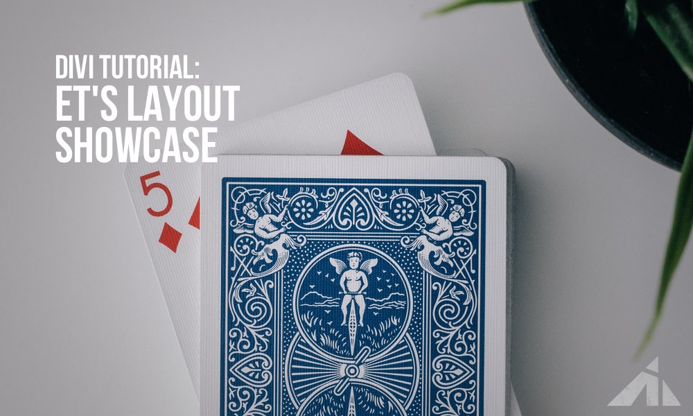
Card deck photo by Aditya Chinchure on Unsplash
The.. red/gray layered Photo by Lasse Møller on Unsplash
The paint? photo by Paweł Czerwiński on Unsplash
Fire photo by Arnau Soler on Unsplash
The yellow photo by okeykat on Unsplash
Ocean photo by Luis Vidal on Unsplash
Bokeh photo by Sharon McCutcheon on Unsplash

Asit aithal says:
Hi PK,
Great tutorial. I’m using the CSS/JS plugin where I created a new file. How do I attach it to the page?
PK says:
Hi Asit, I think you can just drop the CSS in with the plugin without much complications. Most plugins allow you to enqueue a stylesheet as a post, and you just drop it in there and you’re done. You will have to make the divi layout exactly as the tut explains so the selectors work properly. Hope that helps.
David says:
Thank you for this tutorial. The only issue I’m having is on the card the top of the images are cut off until you hover over the card. How can I have the top of the images showing?
PK says:
Hi David, do you have a URL I can check? Thanks
David says:
Sorry for the late reply. I was building the site locally but I added that section to a site that I am creating live so you can see what I mean. The url is alt.laidleyadventistchurch.org.au
PK says:
Hi, sorry for the confusion, I must have mixed up the comments.
For anyone who was wondering what was going on..
If you change this part so it’ll be 50% 0% then the Y position will be 0 and the top will align to the top of the card.
.et_pb_row.ai-triple-overlap .et_pb_column.ai-col-overlap .et_pb_image .et_pb_image_wrap > img {
-o-object-fit: cover;
object-fit: cover;
-o-object-position: 50% 0%;
object-position: 50% 0%;
height: 220px;
width: 180px;
-webkit-transition: all 0.3s ease-in-out;
transition: all 0.3s ease-in-out;
}
PK says:
Hey buddy, I checked the link but I’m not sure what you mean by full bleed nav and slider style. Could you somehow show me a mock-up of what you’re aiming for? Thanks
David says:
Sorry I don’t know what you mean by full bleed nav and slider style. I followed the ET’s Layout Showcase Hover tutorial. Before hover the top of the image isn’t showing until you hover iver it. How can I have the top of the image showing before hover (like they do on ET’s site)?
Is there a way I can send you a screenshot?