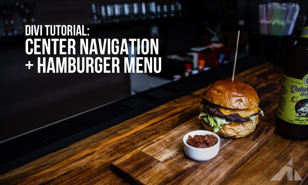
The Preview
I saw a question posted on Facebook asking how to make the header on this site with Divi. It’s a header with an extra navigation menu in the center, with the hamburger on the side. It looks like a great layout for having an extra menu that doesn’t have to be shown so prominently, like ecommerce websites, membership websites, etc. So I decided to make it.
and here it is:
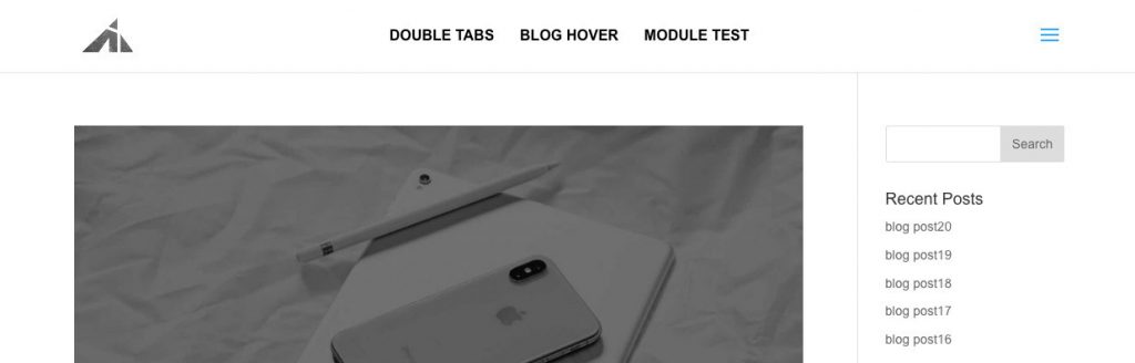
It works well, and I didn’t style for submenus in this case because I figured the center nav should just be the major endpoints, and not the full menu, (that’s why we’re using two menus..?) if you want to style the submenu as well, you’re gonna have to do it yourself in this case.. or just bug me enough and make me do it haha. .. but yeah, If you want to learn CSS and do it yourself..
[sc name=”learn css”]
Onward..
The video
The code
NOTE: the php files mentioned below should be in your child theme. Do NOT make these edits to the parent theme.
[sc name=”get child theme”]
All set?
OK, here we go!
To register a new menu add this php snippet to the bottom of your functions.php file
(if the file has a ?> at the end, add the snippet before, otherwise, just drop it in there. Only thing to avoid is having extra blank spaces at the end of the file. This can cause issues with generating sitemap XML.)
function register_my_menu() {
  register_nav_menu('extra-header-menu',__( 'Extra Header Menu' ));
}
add_action( 'init', 'register_my_menu' );
And add this
<?php wp_nav_menu( array( 'theme_location' => 'extra-header-menu', 'container_class' => 'extra_menu_class' ) ); ?>
to your header.php right above #et-top-navigation so it looks like this:
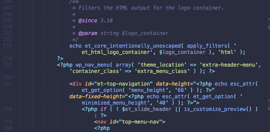
You just made a new menu show up in the header. Now you need to go to the WP backend and add items to the menu, and style it.
The build
Go to “appearance > customize” and then “header & navigation > header format > slide in”. This will put the primary menu into a slide in panel + hamburger.
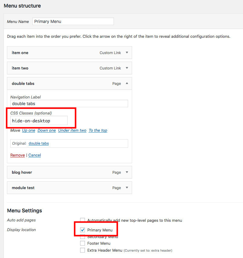
Now that you have your menus ready, you can add items to it on the “appearance > menus” page in the backend.
1. On the new menu, just put some stuff you want in there.
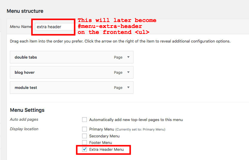
2. On your “primary menu” add everything you need, including the items that went in the center menu.
The reason is because the center menu will disappear on mobile, so you will need them to show up in the (slide in) primary menu. The only thing we’ll do to them is we’re going to add ‘hide-on-desktop’ class to the menu items we want to.. hide on desktop.
The css
Take this CSS and edit some stuff for the text if needed.
.extra_menu_class {
  position: absolute;
  width: 80%;
  top: 50%;
  left: 50%;
  -webkit-transform: translate(-50%, -50%);
      -ms-transform: translate(-50%, -50%);
          transform: translate(-50%, -50%);
}
.extra_menu_class .menu {
  display: -webkit-box;
  display: -ms-flexbox;
  display: flex;
  -webkit-box-pack: center;
      -ms-flex-pack: center;
          justify-content: center;
}
.extra_menu_class .menu .menu-item {
  margin: 0 14px;
}
.extra_menu_class .menu .menu-item a {
  font-size: 16px;
  font-weight: 700;
  color: black;
  text-transform: uppercase;
  -webkit-transition: all 0.5s ease-in-out;
  -moz-transition: all 0.5s ease-in-out;
  -o-transition: all 0.5s ease-in-out;
  -ms-transition: all 0.5s ease-in-out;
  transition: all 0.5s ease-in-out;
}
.extra_menu_class .menu .menu-item:hover a {
  opacity: .6;
  -webkit-transition: all 0.5s ease-in-out;
  -moz-transition: all 0.5s ease-in-out;
  -o-transition: all 0.5s ease-in-out;
  -ms-transition: all 0.5s ease-in-out;
  transition: all 0.5s ease-in-out;
}
.extra_menu_class .menu .menu-item.current-menu-item a {
  color: red;
}
@media all and (min-width: 981px) {
  .hide-on-desktop {
    display: none;
  }
}
@media all and (max-width: 980px) {
  .hide-on-desktop {
    display: list-item;
  }
  .extra_menu_class {
    display: none;
  }
}
Please note: I have taken out the # part because there’s no specificity fight going on, so a few classes work fine.
And there you have it. Pretty neat eh?
I ended up using this on a new project website I’m working on. I think it’ll work really well.
Since I just mentioned it.. if you want to stay up to date on all the stuff I’m working on, then please sign up for my newsletter. I’ll have some cool news soon.
[sc name=”join dot net”]
If you want to learn CSS to customize things yourself..
[sc name=”learn css”]
If you want to dive into responsiveness,
[sc name=”responsive-ad”]
Hamburger Photo by Bobby Rodriguezz on Unsplash

Chris says:
I know this is an old post, but do you have an update?
The header.php file piece doesn’t seem to work anymore.
PK says:
Hey Chris, child themes should still work though?
I think you can add two menus with different settings with the theme builder, can’t you?
Gustavo says:
Hi PK, sorry for bothering you.
Do you have a tutorial where I can see how to display two menus on the desktop with the theme builder?
Certainly it can no longer be done using the header.php
Thank you so much
Segun says:
Thank you for this great article. I was looking for ways to display two menus on the desktop. One in the center and one hamburger. in my searching I came across your article. And I followed it as laid out but I ended up having only a hamburger menu display on the desktop. Am I missing something? Please can you help?
PK says:
Hey Segun, a lot has changed with Divi 4, and we can’t use header.php directly like we used to. It’s a bit more complicated now. The easiest way at the moment is to rely on the theme builder.
However, I can certainly have a look at what you’re building. Feel free to send me an email to my name (PK) at this domain.
Irene says:
Thanks for your tutorial!
One question, how could I make the extra menu only appear when I scroll and the sticky menu appears?
PK says:
Hi Irene, thank you for the kind words.
As for the differentiation of the two menus, you can (assuming you’re using the default menu) hide one by default (with display none), and then when the menu becomes sticky, Divi will add a class (something like .et_pb_sticky_header) and you can have it display block (or inline-block) so it’ll show.
If this makes sense, great, if it doesn’t, please send me an email (pk@) and I’ll see if I can help.
Thanks
al says:
Hi i would like to raise a question why there is showing like e above the header, thanks for the tutorial by the way
PK says:
Hi Al, I’m not sure what you mean? Could you please explain? Thanks
Tone says:
would these steps also work with themes from themify as well?
PK says:
It would depend on how the header file is made. If you’d like a tut, you can submit a tutorial request at http://almostinevitable.com/contact-me/ and I’ll see if I can help!
Lori Newman says:
Hello PK, I have been looking for the past week for something like this. I would absolutely love it if you could make the tutorial on how to do the slide-in menu customizations for this just like the webite. Just followed you on facebook and signed up for your newsletter. Looking forward to seeing more on this – thanks!
PK says:
Hi Lori, happy this could help. I’m not 100% sure what you mean though.. the slide-in customizations.. like which website did you mean? Thanks
Lori Newman says:
My apologies, the one you mentioned in the article https://elevationchurch.org/
Also, is it possible to have dropdowns in the main menu?
Thanks
PK says:
Hi Lori, as for the panel that’s coming in… I suppose I can make a tutorial on adding icons and buttons to the slide in. Thanks for the suggestion!
And yeah, I’ll check on how the dropdowns work in the middle menu.
Lori Newman says:
Awesome! thanks so much!
Luisa says:
Thank you so much for your nice tutorials! They are really helpful and I can learn a lot from tutorials like this. Even though I don’t actually need it, I like to read and understand it to expand my possibilities.
PK says:
Thank you for the kind words!