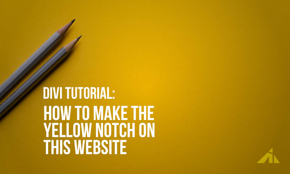
The Preview
Since you’re already ON this website.. look up at the upper left corner of the header. Yeah
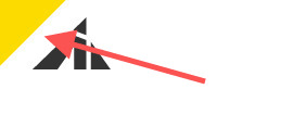
Right there.
Then someone asked me how I did it. So here’s the tutorial on that.
The Video
The Code
#main-header {
	overflow: hidden;
	position: relative;
}
#main-header:before {
	content: "";
	position: absolute;
	display: block;
	top: -76px; /* Play around with the value to get what you want */
	left: -106px;  /* Play around with the value to get what you want */
	width: 260px;  /* Play around with the value to get what you want */
	height: 145px;  /* Play around with the value to get what you want */
	background: #d00;  /* Play around with the color to get what you want */
	transform: rotate(-45deg);  /* Play around with the value to get what you want */
	transition: .3s all ease-in-out;
}
/* This is for the header on scroll */
#main-header.et-fixed-header:before {
	top: -76px; /* Play around with the value to get what you want */
	left: -106px; /* Play around with the value to get what you want */
	transition: .3s all ease-in-out;
}
[sc name=”customcss”]
Pretty simple, right?
PS. If you use a gradient background, sometimes it looks blurry, and I don’t like blurry objects. So I think it’s a low-skill level method.
Need to learn CSS?
[sc name=”learn css”]
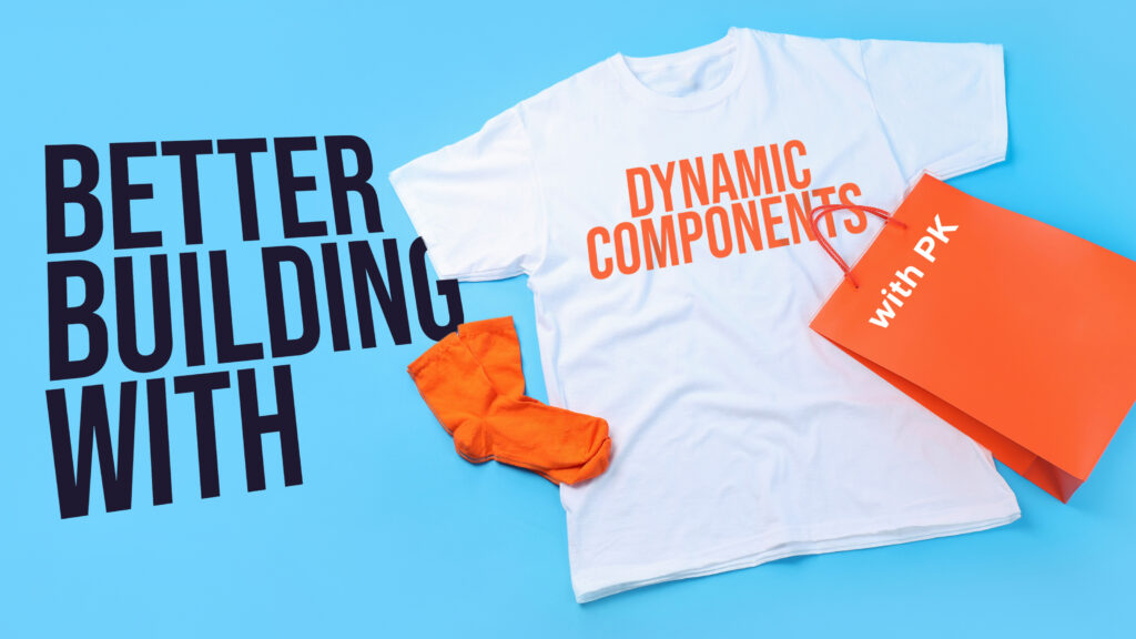
Photo by Joanna Kosinska on Unsplash