This is probably the simplest tutorial/snippet I’ve published on this website.
It’s also one of the most obvious, and I’m surprised I haven’t noticed this before, but yeah, look:
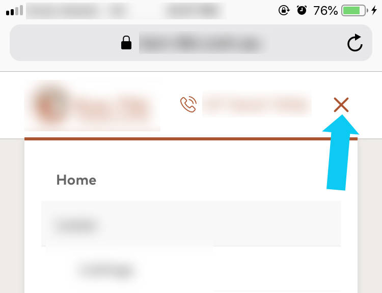
The default Divi mobile menu hamburger stays hamburger even when the menu is opened.
This snippet changes it to an X.
The code
#main-header .mobile_nav.opened .mobile_menu_bar:before {
    content: "\4d";
}
[sc name=”customcss”]
So simple.
more?
For more simple stuff with the hamburger,
Change the size (note: it’s normally 32px, so this example is a bit large, change it to what you want)
#main-header .mobile_menu_bar:before {
    font-size: 45px;
}
Change the color:
#main-header .mobile_menu_bar:before {
    color: red;
}
Here’s how to change the normal hamburger altogether
Also you might want to check out
more header resources
[sc name=”podcast”]
[sc name=”learn css”]
Photo by David Paschke on Unsplash


Asad Badat says:
Super simple but much needed. Thank you!
PK says:
Thank you for the kind words. Happy to help.