After years of making highly responsive Divi websites, here’s a rundown of my solutions to the most common responsiveness questions concerning Divi I’ve seen on the web. (Web meaning Facebook groups.)
Buckle up, this one’s (long and) comprehensive
This post isn’t a single “tutorial” per se, but more like a summary of everything you need, and I’ll be linking to some useful tutorials that’ll provide the solutions… so more like a tutorial collection, like I did here.
But before we get serious…
Let’s get this misguided “method” out of the way.
making separate sections
for each device – Don’t do this.
Here are some reasons why that is a very bad idea.
A. You will have problems with adding # links.
That’s because anchor links (links that look like this)
<a href="#section">Section</a>
will be messed up. This is because those # links are actually added in the id, like this:
<div id="section" class="blue-block">


The link drops you here

</div>
and the browser scrolls to that section. But if there are different sections that have the same thing like:
<div id="section" class="blue-block1">


This shows on desktop

</div>


<div id="section" class="blue-block2">


This shows on tablet

</div>


<div id="section" class="blue-block3">


This shows on mobile

</div>
Then the link won’t work. This causes way too many problems.
B. Adding unnecessary load
This is unnecessarily adding stuff to the load. Especially when it’s used with images. Just text only, I am not happy with, but still it doesn’t cause as much loading problems as much as doing this “tip/trick/hack/buffoonery” with images. However…
C. You get duplicate content on the page (affecting seo)
We don’t get to see it, because we’re humans, but bots do.
Bots aren’t savvy with CSS and its stylings, so for them, it’ll just look like duplicate content, which could easily fall into either boilerplate content or keyword stuffing, neither of which is desirable in terms of SEO. This is really sad since you put in the effort because it’s important content, but it ends up hurting your SEO.
You can read more on this page. Also check out the replies on this page or read the comments on this page
I know some people might be like “hey, I rank well with this method” and I don’t care. It’s still duplicate content, and it’s still just the worst way to do it. (Also, who knows what’ll happen to search algorithms later down the line?)
D. It’s frustrating to manage
Imagine having to edit three sections/rows/modules every time you had to change one thing. It’s really frustrating.
Imagine if you had inherited a site like that. Very frustrating.
E. It’s clunky during resizes
Things just popup or disappear, and it’s very clunky in how it displays when you’re resizing the browser.
It’s even worse when there are multiple images involved. Everything is either there or not, and things just jump around.
Terrible.
F. You won’t get any fine tuning
All you get are two breakpoints: 980px, and 480px. There’s no way of doing anything special for ipads (1024px), and for smaller laptops (1280-1440px). It’s just desktop, tablet, and mobile.
G. It’s just lazy and amateurish
Seeing this being done, advised, or championed is like watching a child performing magic and telling people to close their eyes while they make something disappear. Technically it sort of seems like it works, but it’s not being done properly at all, and they’re gonna have to learn to do it right sooner or later if they want to keep pursuing that field.
If you’re offering web development services for money (ie. professionally) then you should be using media queries, and not the laziest amateurish way possible.
If I offended you and your go-to method, please leave a comment below so I can gleefully delete it.
We should be trying to become better at what we do, and not get upset or defensive about a lazy method just because we don’t want to learn.
Now that the worst idea / “solution” / “method” has been addressed, let’s move on.
the most important thing
Learn CSS. Yeah. Seriously. That’s the most important thing.
Regardless of what your role is, or the job title you consider yourself as, if YOU are the person putting together the website, you need to know CSS. No excuses.
BUT, since we’re just on the topic of solving responsive problems, let’s just keep going for now.
Solution
Here’s what you’ll need to start with.
Media Queries
This is a media query:
@media all and (max-width: 479px) {
    h1 {
        font-size: 20px;
    }
}
That css snippet tells the browser that:
– if the width is 479px at its largest… meaning.. anything narrower than that..
– make the h1’s size 20px.
The important thing is that media queries have their own brackets, so the rules should go inside the media query brackets. (I’ve encountered people that refuse to copy that last extra } and complain that a CSS snippet doesn’t work.. even after I told them that they need that extra bracket… why they wouldn’t listen.. I don’t know…) So yeah, {double {brackets}.}
If you want to really learn all there is about flexbox and media queries, this course is for you. It’s specifically made to solve 99% of your mobile responsive problems with Divi, and even add extra value to your builds. I guarantee it. Years of mobile responsive web coding experience is in that course.
[sc name=”responsive-ad”]
Of course, if you’re a bit scared to dive into the deep end, you can learn all there is about CSS with Divi with this other course. It takes you through everything you need to know about CSS from the very beginning all the way to making your own layouts with just CSS. (it includes mobile responsiveness as well)
[sc name=”learn css”]
Now we can tackle some common problems.
The Divi builder preview size
This isn’t actually a problem, it’s a misconception.
Divi has two major breakpoints. One at 980px and one at 480px. So naturally, the settings revolve around these breakpoints.
The common misconception is that thinking the mobile view and tablet view are actual (common, real-life) mobile and tablet screen sizes.
It’s not.
So if you adjust everything to look “perfect” on those views, 99% of the time, it’s gonna break.
I understand Elegant Theme’s choice on this to an extent.
The reason for using the seemingly arbitrary breakpoints is because they are sort of a ‘catch-all’ size. Essentially, 480px across will cover most phones* and 980px across is the point between landscape(1024) iPad and portrait(768). So basically, what you’re seeing is a max-width: 480px, max-width: 980px situation.
Yes, it’s misleading on ET’s part saying that it’s the “preview” but I think as long as you understand what it is, you can spend more productive time on making your websites work than relying on that single feature to solve everything and complaining if it doesn’t.
* except for the huge Android phones that have fullHD size screens in ‘retina’ so they have 1080×1920 screens which translates to 540×960, so I use an extra breakpoint at 550px myself
So we take complaining out of the equation, now what?
Solution
Well, if you really want to just stick with the builder settings (and not do it with proper CSS), then use the browser inspector to show you the various mobile screen sizes, and check your work as you go.
Wanna learn how to use the inspector?
I actually have a new (free) mini course that goes through all the nitty gritty of using the inspector that you can check out. As web developers, the browser is the first and most important piece of software that needs to be understood.
text bleeding out on mobile
This is pretty much the same thing as
controlling text size on mobile
The reason why this happens is because the letters in each word stick together, and they don’t break unless you ask them to.
I personally think forcing something like break-word, overflow-wrap, and hyphens isn’t always the best idea… because
a. You’re gonna need a media query anyway, and
b. read-
ing some-
thing like
this isn’t
always the
best in leg-
ibility
So I think a little bit more effort should be put in.
Solution
The best way to fix this is to just change the font-size.
The easiest way is to adjust your module settings.
The CSS way is to add a class in the module’s advanced tab here:
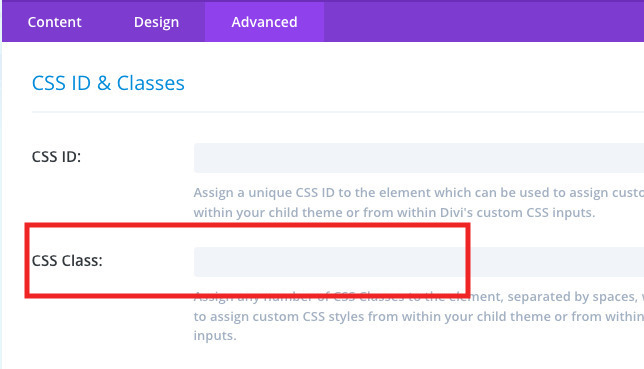
Let’s add… ‘control-text’ in the custom class field.
Then the text inside (let’s say paragraph text) can be controlled via media query like this:
@media all and (max-width: 480px) {
    .et_pb_module.control-text p {
        font-size: 20px;
    }
}
The above snippet means “when the browser is narrower than 480px across, then the p inside a module that has a custom class of control-text shall be 20px in size.”
You can make the adjustments from there.
You can also add a bunch of stuff together inside the media query, and you can make a bunch of minor tweaks, like this.
@media all and (max-width: 768px) {
    .et_pb_module.control-text h1 {
        font-size: 32px;
    }
    .et_pb_module.control-text p {
        font-size: 20px;
    }
}
@media all and (max-width: 479px) {
    .et_pb_module.control-text h1 {
        font-size: 24px;
    }
    .et_pb_module.control-text p {
        font-size: 16px;
    }
}
Once you wrote everything, you can paste it in where custom CSS should go.
[sc name=”customcss”]
So that’s how you control text.
Reference: If you want to hyphenate paragraphs, or just make sure you get all the sizes covered, Learn more about break-word here and learn more about overflow-wrap here.
Note: about using vw for font sizes..
Using vw isn’t a bad idea per se, but it’ll work for very specific cases, for a limited range of screen sizes.
This is because font-size is the height, and vw gets its base unit from width. So it’s not always easy to adjust, and it’s not always directly proportional.
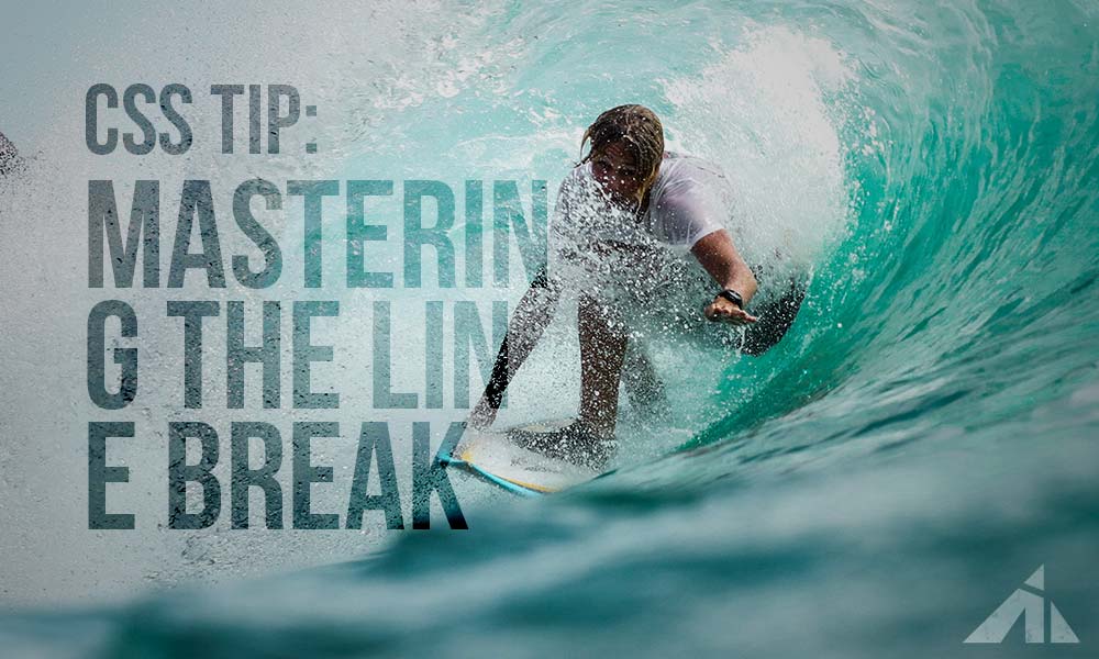
extra solution for line breaks
If you want to learn how to change line breaks, here’s a really cool trick you can use to control the
<br>
The next problem to tackle would be..
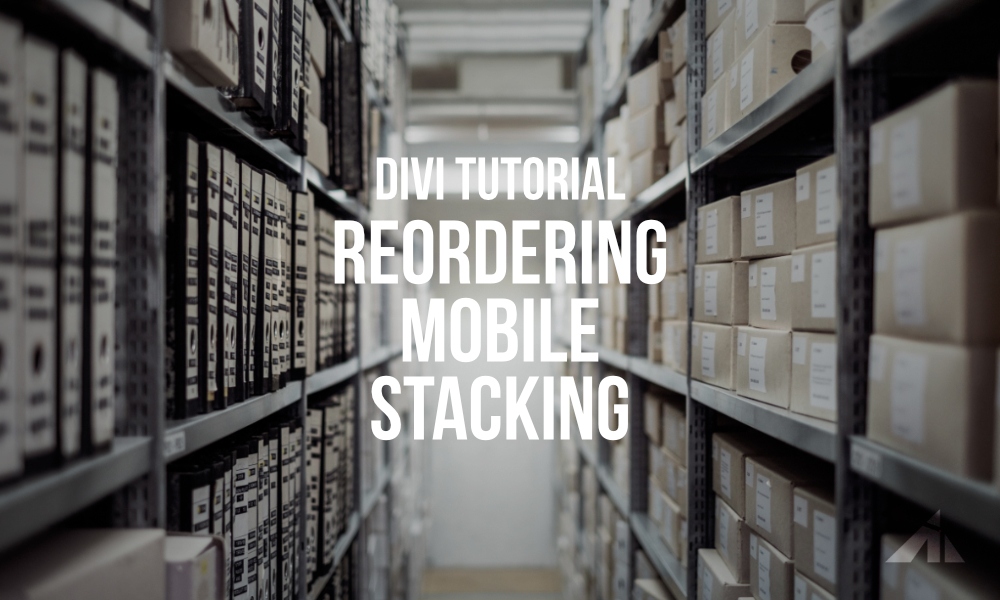
stacking order
This is easily done with flexbox.
I just put up a tutorial on this. Check it out.
making double columns
This one’s also done with flexbox. (flexbox is really great) I already have a tutorial on this. (one of my most popular ones)
background position
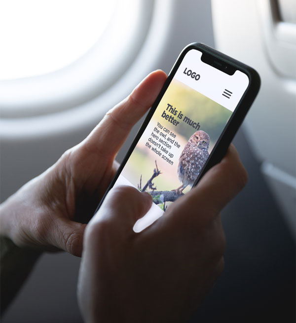
If you’re adding a background image to a section/row/column/module that has the main focus point off-center, then chances are, that background might not look its best when it adjusts on mobile.
On desktop it might look fine.
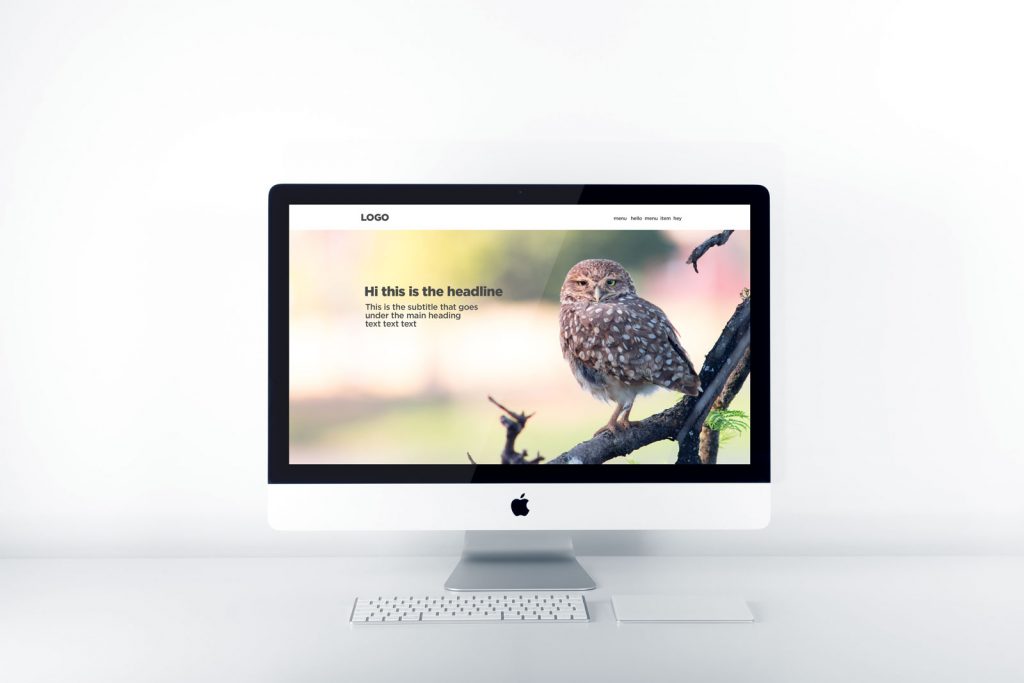
But then, on the phone…

This problem occurs because the image stretches to fit the vertical space, and since it’s centered, the focus point is outside the view port.
So let’s find a way to fix that.
Divi adds background images via CSS. So it’s fairly easy to edit it.
Look for the selector that has
.some-divi-classes {
    background-image: url(https://theURLfortheimage);
}
That’s how Divi adds the background image. (note: .some-divi-classes = Divi builder classes like .et_pb_section, etc. Don’t use classes with numbers on them, like .et_pb_section_0 because those numbers change as soon as you move them, which is why things break. That’s why you should add a custom class)
The position is controlled by one property.
.some-divi-classes {
    background-position: center;
}
That’s the default setting.
You can change it like this:
Start by adding a custom class like mentioned before, and now you can write CSS like…
.some-divi-classes.custom-class {
    background-position: left center;
}
background-position is shorthand for -x and -y, so it’s the same thing as
.some-divi-classes.custom-class {
    background-position-x: left;
    background-position-y: center;
}
solution 1
So all you need now is to change the background position inside a media query.
Something like this:
@media all and (max-width: 479px) {
  .some-divi-classes.custom-class {
      background-position: center;
  }
}
Again, if you’re having problems using the inspector, learn for free here:
solution 2
Another important thing to remember is that the section is usually too tall. So the background tries to fill the space, and since mobile is usually portrait and desktops are usually landscape, it’s hard to keep the focus of the image consistent.
So, a really simple solution to this is to change the height of the section with media queries.
Something like this works much better:
Useful Tip
Don’t use height: __ vh (relative) or __px (absolute) sizes. .. err.. try not to use “height” if there’s a lot of content in the section. The text will be pushed out of the section, and it’ll become a hassle to control. Rather, use paddings and/or margins around the text to get the section to stretch out.
layout change
Here’s something cool. You can actually change whole layouts. Of course, this works much better when you are coding everything from top to bottom, but it’s still not too hard to do with basic level CSS, as long as you understand how layouts work.
I can’t go into much detail right now since every layout is different, but here’s an example of how you can take a desktop oriented solution and make it work on mobile devices with some CSS.
Next…
Suggested screen sizes to check
After all this, the most MOST important factor to think about is screen size.
Yes, screen sizes. Which ones are used the most? Do you know the answer?
Anecdotal evidence isn’t very helpful, so let’s check the actual stats (source).
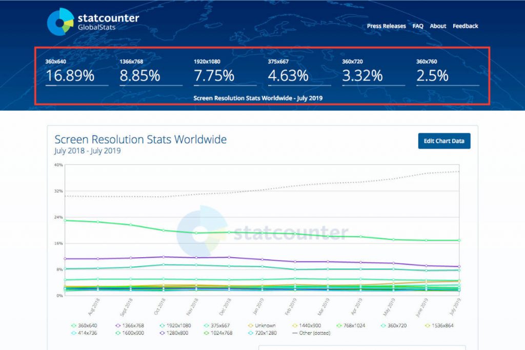
Here are some tidbits we can glean from this stat:
- 360×640 is the most popular: This is the mid range Android phone size. Wha…? Yeah, it’s the ‘retina’ display pixel count for 720×1280 which is the most common Android screen size. (The higher models have fullHD which is 1080×1920 translated to 540×960)
- 1366×768 is also very popular: This is the mid-size laptop screen. Usually between 12″ and 14″.
- 1920×1080 is next: This is the 21″-24″ screen fullHD desktop screen size.
- Next is a few 360s with a 375: the 375 is the iPhone 6, 7, 8 (non plus), and the 360 are the other Androids.
Now consider your regular development environment.
If you’re reading this post, you most likely have a sweet setup. Possibly a large iMac, or a MacBook Pro, or a dual screen (or more!) Windows desktop, with maybe an extra laptop, iPad, Surface, iPhone, Galaxy, etc.

More often than not, we use a large screen for the majority of our work.
This means we don’t see web pages in the sizes that most of the world sees it. We have way more pixels working for us.
Consider this: The main Facebook feed is only 500px across on desktop.
Seriously.
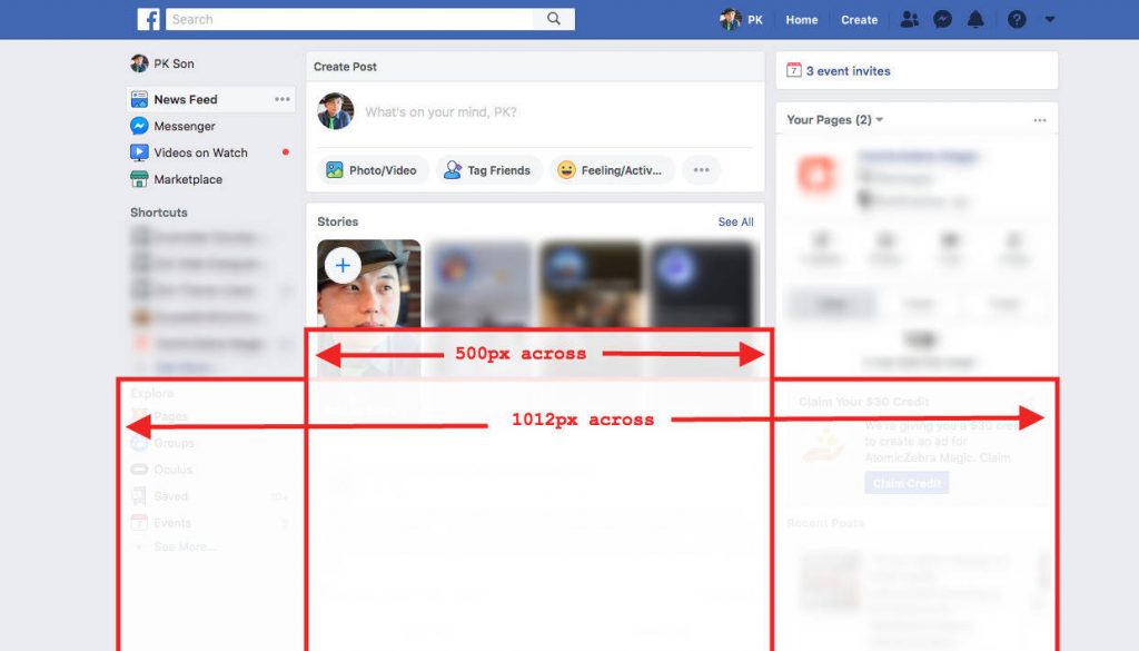
Go ahead, inspect your Facebook page.
solution
You’ve gotta…
Think slightly smaller
One thing that I’ve noticed very often is that when people design on their own screen, they forget what it actually looks like on other screens. A lot of the time, things end up being slightly larger than they should be. This is a great way for getting
words broken off mid-sentence.
Some useful media queries
Here’s a simple list of common breakpoints you might want to use as a template in your CSS file.
/*** Any desktop larger than a laptop - this query goes HIGHER than 1400 ***/
@media all and (min-width: 1401px) {
}

/*** Regular laptops - this query goes BELOW 1400 ***/
@media all and (max-width: 1400px) {
}

/*** For the people who love to resize or keep windows open haphazardly ***/
@media all and (min-width: 1025px) and (max-width: 1399px) {
}

/*** All the mobile devices ***/
@media all and (max-width: 1024px) {
}

/*** iPad landscape and more resizers ***/
@media all and (min-width: 769px) and (max-width: 1024px) {
}

/*** iPad portrait and below ***/
@media all and (max-width: 550px) {
}

/*** iPad portrait and more resizers ***/
@media all and (min-width: 551px) and (max-width: 768px) {
}

/*** Phablets and all phones ***/
@media all and (max-width: 550px) {
}

/*** Regular sized phones for non-Shaq sized people ***/
@media all and (max-width: 479px) {
}
I normally keep a list of about two dozen breakpoints (not kidding) in my library and use them (and change the sizes) whenever needed. I usually end up using about 6-10 breakpoints in any given build. There are quite a few responsive-ready build methods that I try to keep when developing, and it has cut down the number of breakpoints a bit, but I still check every screen size possible, and it needs quite a bit of work.
another round of ads
Learn all about flexbox and media queries and extra tricks and how to use them properly integrated with Divi with this course.
[sc name=”responsive-ad”]
Or you could take a more comprehensive course and learn all about CSS + Divi with this course:
[sc name=”learn css”]
Or learn everything at a discount here:
and finally….
Conclusion
“Beautiful on all screen sizes” is a phrase that I’ve seen thrown around everywhere, but it’s rare to see websites that actually do this well.
It takes a LOT of time and care to make everything actually look great on ALL screen sizes.
For the record, I actually check every page on screen sizes from 375px to 1920px going through every pixel size. It takes a LOOOONG time to go through 1575 sizes multiplied by number of pages (multiplied by browsers, and devices). I’m not kidding.
There is no “easy way” to do this, nor is there any theme/framework in existence that does it perfectly without manual configuration.
It takes a lot of care and dedication.
If you want to really offer great value to your clients, really embrace what mobile responsiveness does and make the most of it.
Invest the time to really get into it, and you’ll be happy and proud that you did.
[sc name=”podcast”]
Image credits
Featured image of iPhone Photo by Daniel Korpai on Unsplash
iPhone Mockup from: Designmodo
The iMac mockup can be found on Behance here.
The other iPhone mockup is from dribbble here.
Owl photo by Bruno do Val on Unsplash
Antelope Canyon photo by Hari Panicker on Unsplash
Concert finger horns photo by Luuk Wouters on Unsplash
Desktop Photo by Christopher Gower on Unsplash

S says:
Am I being super thick… in cpanel manager, my child theme has style.css, but its virtually an empty file. If I make any changes in the main theme, they will be erased on the next update.
Divi has the option in the builder to add css, but I presume I need to alter code that exists, not add some.
If I want to change the background alignment css, where do I do that?
PK says:
Hi S,
The child theme stylesheet will not be changed even after Divi is updated (which is why we use child themes). For your use case, you should probably add the CSS to either the page CSS, the style.css file, or the Divi custom css field.
A really great thing about CSS is that you can add code that can override what the default is loading, so you don’t have to worry about your code being overwritten. Hope that helps!
James says:
Thank you. Thank you. Thank you.
PK says:
Hi James, happy to help!
Bill says:
Lol. I had to post this comment now even before finishing the article. No more than 5 minutes ago I finished doing exactly what you say not to do at the beginning of the article. I created 3 copies of my global header and hid them on various screen sizes. Now i will go back and finish the article to see if I can learn a better way to do it.
Patty says:
With all due respect, I’ve been writing CSS for 20 years, and I find that I need very little in Divi. It has a thousand detailed settings, and it makes a lot more sense to me to use those as much as possible. I notice this trend among Divi users to want almost every problem to be solved with a block of CSS — preferably given to them by someone else. Even just mentioning CSS a lot seems to be a kind of status thing. (“I write code! How cool am I?”)
I recommend try to use as little custom CSS as possible. Learn CSS, definitely, but not for the purpose of hacking the **** out of Divi rather than learning it. 🙂
PK says:
Hi Patty, thanks for your input.
Your “due respect” is pretty useless here.
I don’t care if you’ve been “writing CSS” for 20 years (which is surprising that you would say that), nor do I care whether you think you don’t need much CSS with Divi, because you are wrong. I can get into the nitty gritty of why sticking to Divi’s settings just doesn’t work with responsiveness, but considering that you’ve replied to a post that explains why you need you learn CSS, I think it just fell on deaf ears.
You seem to think you know enough, but Divi has made it obsolete. That’s just ridiculous. It hasn’t even been a MONTH since ET has included positioning in their module settings. So… yeah. I don’t know what you think you thought was “writing CSS” but you’ve been doing it wrong.
Suffice to say that I think you’re totally wrong, and I don’t care, but I’ll just leave your comment just so I can leave my reply.
Also, spare me if you think I don’t know Divi or that I should learn.
Travis J Schneider says:
I started my digital agency as a site hustle doing pokey little Divi websites for blue-collar businesses that can barely turn on a computer. That’s fine for earning a few hundred bucks every now and then but I’m starting to get more professional clients and my Divi skills aren’t enough. Thank you very much for this post and for providing the code. I fixed in 20 minutes what I couldn’t find a solution to in hours of messing around with just the Divi builder.
PK says:
Thank you for your kind words. It’s always a pleasure to help. Thanks!
Olga says:
Great post, thank you for writing and getting into all nitty-gritty of responsive design. I agree the most important thing is to learn CSS.
PK says:
Hey Olga, thank you for the kind words.
Yeah, any/everything has limitations compared to actual raw code, and in more cases than not, it shows in the final work.
Thanks for dropping by!