This is part of the ongoing Divi Header series that I’ve decided to keep doing.
Here’s another header tutorial
I’m sure Elegant Themes will come out with a slew of header options in the visual builder (probably) soon, but for now we’re gonna take the raw code-editing approach.
So… have you noticed that the full screen menu is annoying from an UX perspective?
Have a look.
Here’s how to fix it.
The problem
The full screen menu has been around ever since Divi first came out. It’s the least used menu format from my experience browsing Divi websites. I don’t use it much (or at all) either.
I think it’s because of the following UX problem.
Here’s the hamburger:
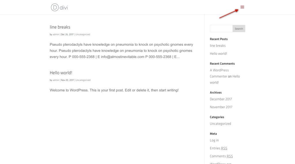
(To learn how to change the hamburger icon, click here)
And here’s the screen with the full-screen menu:
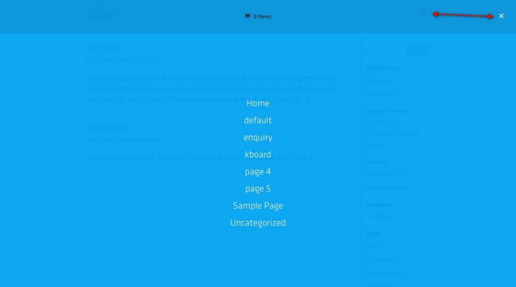
See that huge positioning discrepancy? The mouse has to move too much for something that should have been a simple click on/off.
I think this is a problem.
And so we change it.
This one’s pretty simple, and not scary at all!
Child theme
Yes, any edit you make to the theme files should be made in the child theme.
Get a pretty useful child theme by clicking this text.
Moving on.
The video
The Code
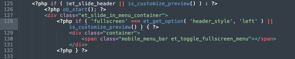
Open up your header.php file.
On line 129 you will find this:
<span class="mobile_menu_bar et_toggle_fullscreen_menu"></span>
Add a container around the close button like this:
<div class="container">
	<span class="mobile_menu_bar et_toggle_fullscreen_menu"></span>
</div>
It should look like this:
And now we style it. Easy peasy.
.et_header_style_fullscreen .et_slide_in_menu_container {
	padding-top: 0px !important;
}
.et_header_style_fullscreen .et_slide_in_menu_container span.mobile_menu_bar.et_toggle_fullscreen_menu {
	top: 24px;
	right: 0px;
}
/*This adjustment seems to shift the logo on mobile, so the following is needed */
@media all and (max-width: 980px) {
  #logo {
          margin-top: 16px; /* Adjust this according to your logo */
  }
}
[sc name=”learn css”]
[sc name=”responsive-ad”]
Photo by mohammad alizade on Unsplash

tess e. says:
Hmm, the problem with this is that as soon as the screen size changes, they no longer align :/
PK says:
Hi Tess,
I suppose you’re going to have to give it a little bit of work to make it look and act that way you would like.
Feel free to email me via the contact page link in the footer and I’ll see what I can do.
Thanks
Md Shojon says:
I using Divi for the last 5 months and I very satisfy with it. Because I find every solution to problems when I need it. Thank you.
PK says:
Hi Md, thank you for the kind words!