This one is a really useful tip that I think you’re gonna like.
Aligning buttons. Woot!
Note: This can apply to lots and lots of other cases, I might make more tutorials on flexbox, because I love it so much, but that’ll come later. After I finish this one.
Edit
If you want to learn flexbox and how to build using Divi with awesome responsiveness in mind, check out this course I made.
So, here’s where we start.
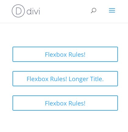
Let’s add three buttons. All in one column.
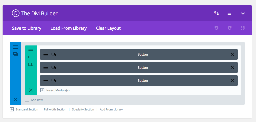
It looks pretty great at this moment.
Just like a test site should.
Now, to flex these bad boys.
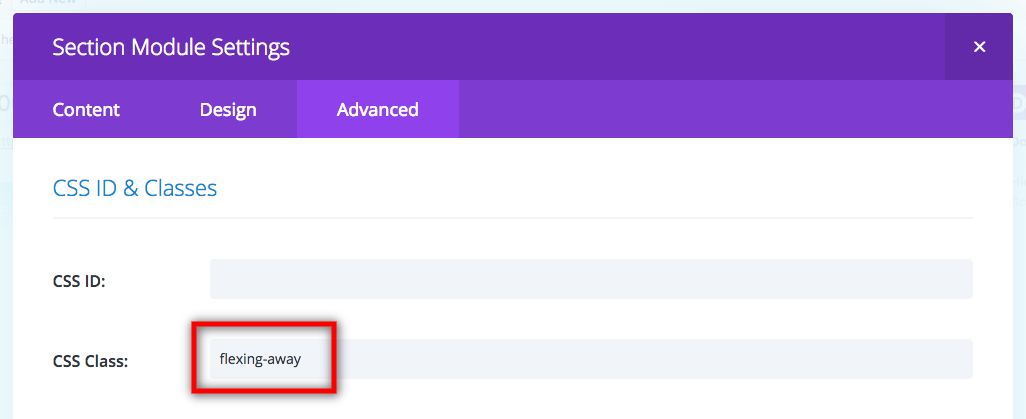
First, let’s add a class to the section so we can use this in other places later.
Now to code the alignments.
Note: The final code will be at the end of this post, so you don’t have to copy paste every line separately. Just read along for now.
First, the way flexbox works is by changing the display type. But we need to make it filter down through the row and into the column where it’s needed.
.flexing-away .et_pb_row .et_pb_column {
	display: flex;
}
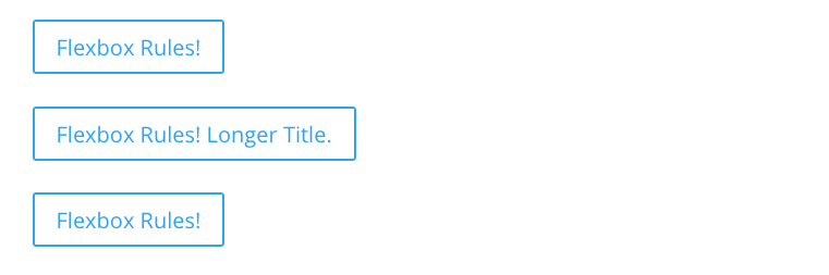
This gives us:
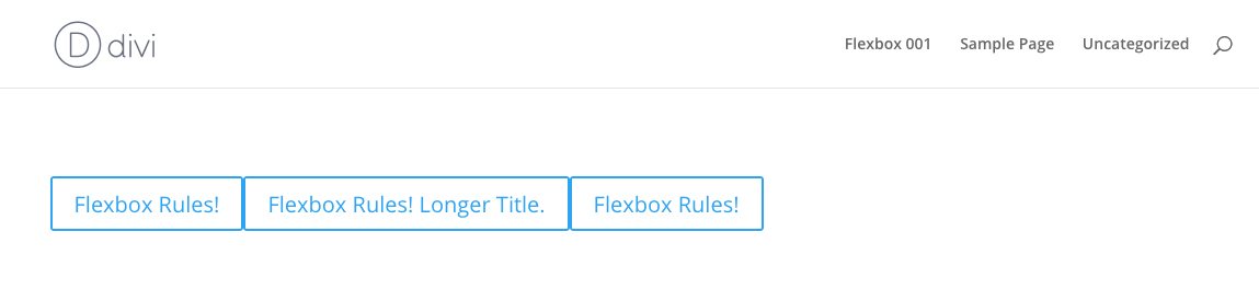
As you can see, the previous stacked layout is now on one line.
What flexbox does is it scrunches up all the elements inside its display area, and puts them all next to each other.
So we’ll need to align them. Let’s align them to the center both vertically and horizontally.
justify-content is used for horizontal alignment, and align-items is for vertical.
.flexing-away .et_pb_row .et_pb_column {
	display: flex;
	justify-content: center;
	align-items: center;
}
This gives us:
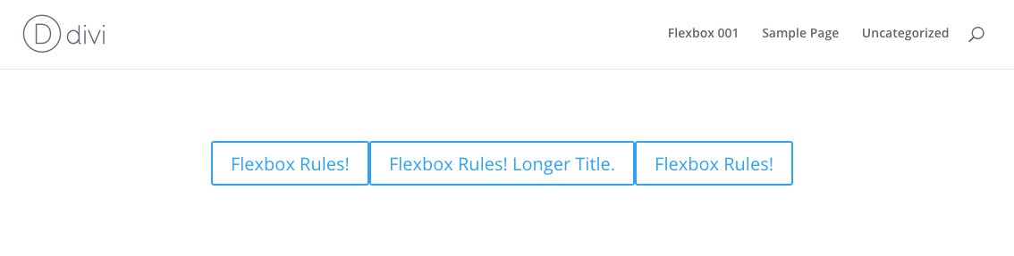
Yay! Progress!
So what we need to do now is to give the buttons some space between them.
There are a couple of ways of doing this..
1. Give the middle button margins to the left and right.
2. Give all the buttons half margins to the left and right.
It’s up to you on how to add the margins as well. You can do it through the Divi builder settings, separate css in the button’s custom css settings, add an nth item selector to the column, or just do it in what I think is the easiest way: just target all the buttons and give them some margins. Like this:
.flexing-away .et_pb_row .et_pb_column .et_pb_module {
	margin-left: .2rem;
	margin-right: .2rem;
}
The reason why I wrote the css as above is because
a. it’ll target the modules inside the sections you assigned with .flexing-away, and not any other modules
b. it’ll also target other modules if in such section, which you might need, and
c. I use rem units, but you can change it to ems, or px, it’s up to you. I personally like rem.
So here we have it!
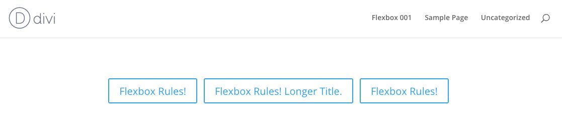
Pretty nifty, eh?
But what about MOBILE????
Ah, yes. We can’t leave out mobile.
So we need to do two things:
1. make the buttons stack
2. make them 100% width with the text inside centered.
here’s the css for that
@media all and (max-width: 479px) {
	.flexing-away .et_pb_row .et_pb_column {
		flex-wrap: wrap;
	}
	.flexing-away .et_pb_row .et_pb_column .et_pb_module {
		width: 100%;
		text-align: center;
	}
}
Of course, you can try resizing the browser, and see what you like and change the max-width pixel width to assign when the buttons are gonna stack.
and there you have it.
Note: all the css should be added in Divi > theme options > custom css for this new super power to be applied across the whole website.
Here’s the final code snippet. I added comments for you to easily modify.
.flexing-away .et_pb_row .et_pb_column {
	display: flex; /* add flexbox */
	justify-content: center; /* keep items centered horizontally */
	align-items: center; /* keep items centered vertically */
}
.flexing-away .et_pb_row .et_pb_column .et_pb_module {
	margin-left: .2rem; /* change to whatever pixels you want */
	margin-right: .2rem; /* it's good to have the same margin on either side */
}
@media all and (max-width: 479px) {
	.flexing-away .et_pb_row .et_pb_column {
		flex-wrap: wrap; /* let the items start switching lines */
	}
	.flexing-away .et_pb_row .et_pb_column .et_pb_module {
		width: 100%; /* no more space left after 100%, so the buttons will break lines */
		text-align: center; /* leave this line in if you want the text inside the button to be centered */
	}
}
[sc name=”customcss”]
[sc name=”learn css”]
[sc name=”responsive-ad”]
[sc name=”podcast”]
Edit:
Because it would seem fitting to show a few real life examples of how this works in the real world, I have added some examples.


[sc name=”learn css”]
[sc name=”responsive-ad”]
Stay tuned for more on Divi+flexbox, and some comprehensive flexbox tuts.
Photo by Ross Papas on Unsplash

Jyl gab says:
Hello PK,
Thanks a million. I was able to adjust the size of the buttons using your recommendations. I am satisfied of the new look when viewed on mobile.
Glad to have you on the net. Am sure this info would also be essential to other developers.
I’ll be visiting your site often to keep up with good info.
Regards
PK says:
Hi, glad that worked!
Thank you for the kind words. 🙂
Have a great day!
Jyl gab says:
Hi PK,
The url is http://TheKnightsChessClub.com
It’s the homepage, 1st slide. I’ll unlock the content when I get home so you can inspect the source elements.
Thanks
PK says:
Hi, I took a look at your site.. and
Start with adding ‘flexing-buttons’ to the slider module.
Add this CSS
.flexing-buttons .et_pb_slides .et_pb_slide_0 .et_pb_slide_description .et_pb_button_wrapper {
display: flex; /* add flexbox */
justify-content: center; /* keep items centered horizontally */
align-items: center; /* keep items centered vertically */
}
.flexing-buttons .et_pb_slides .et_pb_slide_0 .et_pb_slide_description .et_pb_button_wrapper .et_pb_button {
margin-left: .2rem; /* change to whatever pixels you want */
margin-right: .2rem; /* it’s good to have the same margin on either side */
}
@media all and (max-width: 479px) {
.flexing-buttons .et_pb_slides .et_pb_slide_0 .et_pb_slide_description .et_pb_button_wrapper {
flex-wrap: wrap; /* let the items start switching lines */
}
.flexing-buttons .et_pb_slides .et_pb_slide_0 .et_pb_slide_description .et_pb_button_wrapper .et_pb_button {
width: 100%; /* no more space left after 100%, so the buttons will break lines */
text-align: center; /* leave this line in if you want the text inside the button to be centered */
}
}
The buttons will now be in a flexbox, and they should act accordingly.
However you’re most likely going to have to adjust the margins, and/or button size, and the slide content width to get things to look correct.
Hope this helps.
Jyl gab says:
Hi PK,
Its now aligned but a little wider. Button size is good when viewed on desktop, a bit wider on mobile. Is there a way to shrink the button on mobile?
Thanks a lot for all your help.
PK says:
Shrinking the button would be most likely done directly via CSS. …
I’m not sure how the modules work, to be honest haha
I normally just add and style a button directly in html, and not use the builder just for this reason.
Anyways, if you’re gonna style all the buttons in the slider, then add your styling in here:
@media all and (max-width: 479px) {
.flexing-buttons .et_pb_button {
}
}
otherwise, if you want to target just the first slide, then add your code here.
@media all and (max-width: 479px) {
.flexing-buttons .et_pb_slide_0 .et_pb_button {
}
}
You’d probably add stuff like font-size and padding.
Hope this helps!
Jyl gab says:
Hi PK,
Thanks for your prompt reply. I’ve applied the “flexing-away” via the Fullwidth Slider Module CSS Class, and its code under Divi -Theme Option – General – Custom CSS.
The problem is with the 1st Slide that contains 2-buttons; Sign-Up & i-Chess. These buttons are not aligned when viewed on Mobile
.
PK says:
Ah. Well, the sliders have a vastly different HTML structure, and the full-width sections are also different from regular sections. So it definitely should not work.
If you post (or email me) a URL, I can get you the CSS you’d need.
Thanks
Jyl gab says:
Hello,
I was looking for solutions to fix the alignment of the 2nd button when viewed on mobile, the 2nd button was added by Divi Booster.
I have applied the .flexing-away to the Fullwidth Slider CSS but it did not fix the problem.
Thanks in advance for your time in reviewing my site.
PK says:
Hi Jyl!
I’m curious how you applied the CSS?
Also, I can’t see the URL, so it’ll be hard for me to check?
Feel free to email me with whatever details if you find that route better.
Thanks
Joko Ruwhof says:
Thank you. Nice tutorial and solution. In my case, It is not usable due to other elements in the row.
I found the following solution:
1. Add “button-center” to CSS class in the row settings.
2. Add this to custom CSS:
.button-center .et_pb_column {
text-align: center !important;
}
.button-center .et_pb_button_module_wrapper {
display: inline;
}
PK says:
Hi, when there are other elements.. it won’t work exactly as shown in the tutorial. 🙂
The solution you have here will work to an extent (and of course, since I haven’t seen the page, there could be other factors) but generally speaking, in order to have a better looking button with better size/padding/margin control, using an inline-block is suggested.
Thanks for the comment!
PK says:
Reply to Susan:
Hi, thanks for the question.
I checked your website just in case you were asking about your website, and I found some buttons that had the problem you mentioned.
It turns out that the third button has a negative margin.
.et_pb_button_2_wrapper {
margin-top: -29px!important;
}
That would probably be generated from editing in the builder.
A safe way to circumvent this problem on mobile would be to do something like this:
@media all and (max-width: 479px) {
.et_pb_section.flexing-away .et_pb_row .et_pb_column .et_pb_module.et_pb_button_2_wrapper {margin-top: 0px !important;}
}
That would probably safely override that problem.
Feel free to email me if you’re having more problems.
Faller says:
Hey and thx for this tutorial. took me long time before i found it 🙂
but i have a problem with it . when i do it with 3 buttons the last one is lower than others. any idea ?
https://imgur.com/a/Vc3zy
PK says:
Do you have a link I can check? It could be that there’s a pseudo element hiding somewhere, or it could be how Divi gives the last element a margin of 0, or.. something..
It always helps to see the actual rendered result. So a link would help me find the fix. (or you can email me the link)
Thanks!
Faller says:
hey thx for your answer im a beginner and i dont understand what is going on. here is a example : http://www.magphoto.fr/30440-2/
on firefox it’s ok but not on chrome. i dont get it.
thanks for your time!
Faller
PK says:
Hi, it was this: “or it could be how Divi gives the last element a margin of 0”
So Divi gives all the modules a margin-bottom of 2.75% except for the last module. That’s why that is happening.
It doesn’t show on Firefox because FF doesn’t use % margins/paddings.
So to fix this, I suggest taking away all the bottom margins in the modules.
add a line in the CSS so it looks like this:
.flexing-away .et_pb_row .et_pb_column .et_pb_module {
margin-left: .2rem;
margin-right: .2rem;
margin-bottom: 0px;
}
and you’ll be fine.
Susan says:
Hello!
I am having the same problem. I have three buttons using your flexing away code and they are working perfectly except for the last button. The third button is lower on the desktop than the other two. When I use the code you have above to remove the bottom margins in the modules my desktop looks perfect but mobile makes the third button touch the second one instead of spacing them apart. Any suggestions?
Faller says:
Thanks for your time !!! and have a nice day !
Paul says:
Thanks, great tutorial.
Have used flex in some situations but need to learn more.
PK says:
Hi Paul, thanks! I’ll post more tuts on flex. It’s seriously a really good set of CSS tricks worth learning.
Joffry says:
Hi PK,
Thank you for this clear tutorial!
And what would be the difference if you work with 3 columns with 3 buttons in a row from let to right?
When would you use your solution and when the other, can you provide examples?
Thanks in advance 🙂
PK says:
Hi, Joffry!
1. using 3 columns means the buttons will be spaced out in its own column which means they won’t be together in the middle. (Give it a try, it won’t look like it does here)
2. you can do this with way more than 3 buttons if needed
3. the button text can all be different lengths and it’ll still stay together and align well.
Hope this answers your question!
Joffry says:
Thank you PL!
In which particular situation would you choose to use this?
Just curious how you look at it?
PK says:
One example where I used this method was for a horizontal banner that had a couple of different pdf downloads. I have added some real life examples to the original post. Have a look!
Anonymous says:
5
Pablo says:
Excellent tutorial, PK.
What if you want to stack all the buttons on desktop but want them to look all the same size? Do you use flex-wrap in that case?
PK says:
Hi! Well, if I understand you correctly, you’re looking for something like
[ button ]
[ button ]
[ button ]
Right?
Then, I don’t think there’s much reason for flex on this one.
Just resizing the button modules to be the same width would be fine?
I might be missing a crucial part of the question though… haha
Anonymous says:
4.5