
I don’t know about you, but for me, mobile responsiveness is important. Like, really important.
At work, I spend hours working on how every single page looks like on up to 7 screen sizes, 5 different devices, with 3-4 browsers per device.
(I’m not kidding. It’s a LOT of work, but I’m happy that the websites I build look great anywhere, everywhere.)
Plus we work on making every margin, padding, leading, tracking, and font-size look its best on any given device.
However, the mobile responsiveness of Divi is very underwhelming.
It doesn’t have many breakpoints, nor does it allow you to control how they respond.
Does any other theme/builder allow you to do so?
Well, some do partially, but there’s no ONE builder or theme that does everything properly.
So we might as well just code things ourselves. 🙂
Notice
If you want to learn how to edit Divi and build with awesome responsiveness in mind, check out the course I made.
Back to the post… So, flexbox to the rescue.
Here’s an example of how you can use flex to control responsive behavior.
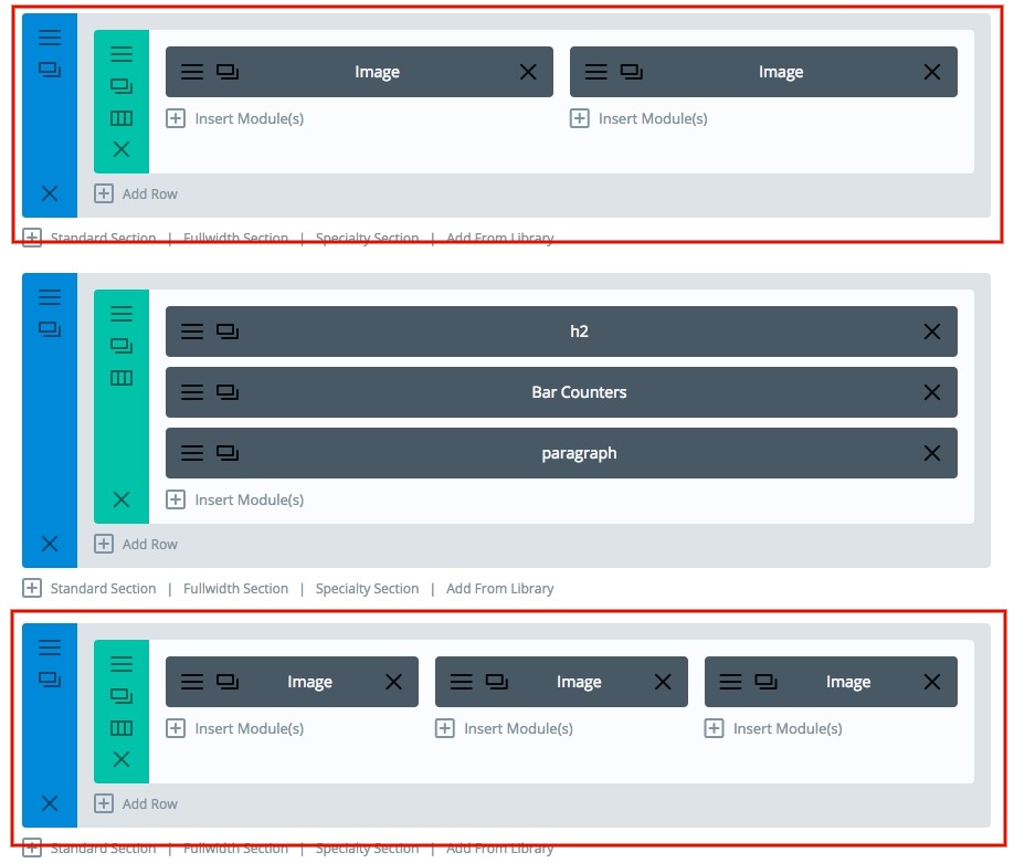
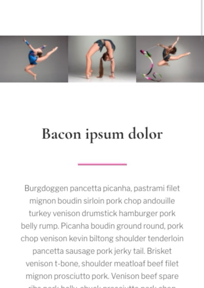
Let’s start with some full-width multi-column image banners.
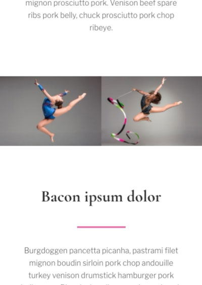
Here’s a simple layout. (It’s a bit bandy, but this is just for demonstrative purposes, so please excuse the bandiness. haha. Oh, and I’ve offered to redo my daughter’s gym’s website, so I have some stock photos of gymnasts, dancers, and ballet..ers..? ballers? no.. ballet dancers..?.. anyways, that’s why I’m using those photos..)
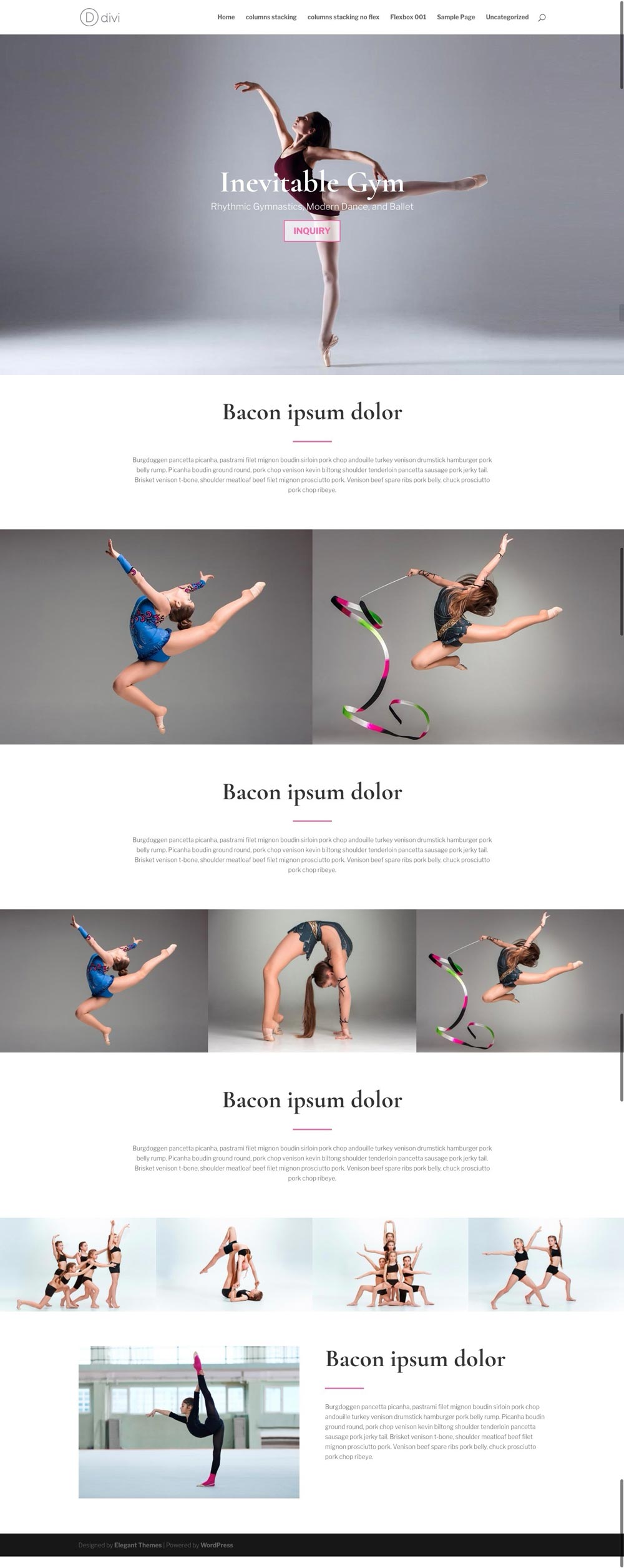
Looks nice. However, the problem arises when we get to mobile.
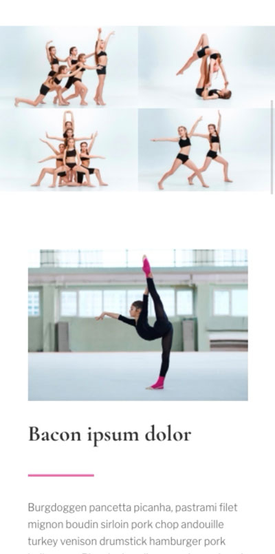
I know y’all know how things stack, but yeah, here, have a look..
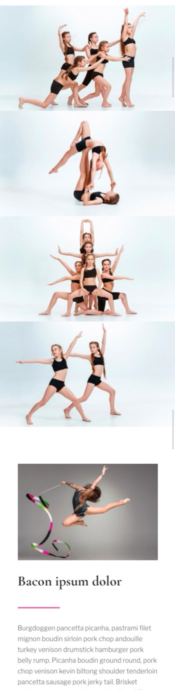
I think there are some problems with this kind of stacking.
a. The original layout was made in a way for the 4 images to be just a horizontal strip, and the image below that section is supposed to be more prominent. However, in mobile, the 4 images are WAY more prominent. Not ideal.
b. Too much scrolling for images that are not important enough to fill the whole screen and more.
I think that’s a problem.
So, let’s find a way to fix this.
First, let’s make the images clickable into lightbox. So even when the images are smaller on the phone, people can click it to zoom in.
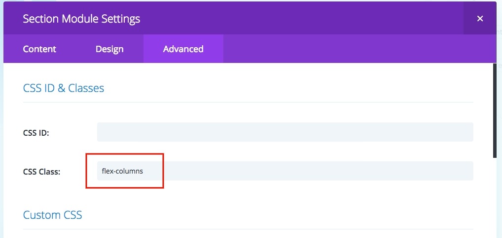
Next, let’s add some classes to the sections.
Start with flex-columns
Let’s do this to all the sections that will have images all the way across with 2, 3 columns.
However with a 4 column section..
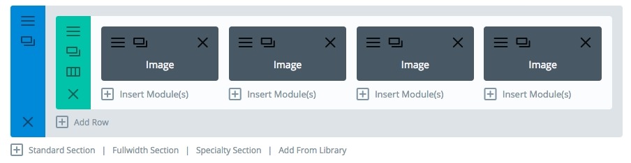
Let’s add something extra:
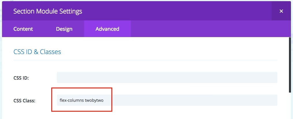
So, why did I do that? I think 2 or 3 images side by side on mobile is okay, but 4 is a bit too much. It’s a bit too small per picture, so I think they should be a grid of 2 X 2. So I added another class to make that section different.
And here’s what we get!!
2 columns
3 columns
4 columns
Of course, you need to add the css, that’s right here!
@media (max-width: 980px) {
.flex-columns .et_pb_row {
  display: flex; }
.flex-columns.twobytwo .et_pb_row {
  display: flex; }
.flex-columns.twobytwo .et_pb_row {
  flex-wrap: wrap; }
.flex-columns.twobytwo .et_pb_row .et_pb_column {
  width: 50%; }
}
@media (max-width: 479px) {
.flex-columns.twobytwo .et_pb_row {
  flex-wrap: wrap; }
.flex-columns.twobytwo .et_pb_row .et_pb_column {
  width: 50%; }
}
(update: somewhere around mid 3.20’s version of Divi, ET lowered and changed the CSS specificity, so I took out the !importants. If you’re on an earlier version, and the default CSS is overriding this CSS, then add the !importants back in after the ‘50%’ parts.)
[sc name=”customcss”]
I’ll break it down for you:
1. Flex is added
2. The columns stay together. (This means you can use this for other types of modules, not just images!)
3. They won’t go all HUGE FULL SCREEN WOAH WHAT’S GOING ON on iPad portrait. (I dislike the monstrous stacking on iPads, portrait is still a great size to consider it paper-like, meaning, horizontal layouts are totally fine.)
4. The four column section gets flex-wrap applied.
5. The columns inside the wrap gets 50% width, so they’ll stay together in a 2X2 grid.
(Best part is) you can use this for other types of modules too!
I don’t have a demo layout for you to check, you can watch the video, to see it in action.
Hope this helps, if you have any questions, let me know in the comments below!
[sc name=”learn css”]
[sc name=”responsive-ad”]
[sc name=”podcast”]
PS. I have thought about sharing the layout (for free), and if you’re interested, let me know, and I’ll try to hurry and package it and upload it. Oh, and how about signing up for the newsletter to stay updated? Thanks!
Edit: cleaned up the CSS a bit to make it easier to read.

Mandy says:
Hey PK,
Thanks for your generosity with your time!
I’ve got your code working all great.
The only problem I have is that even without adding “twobytwo” to the css class for sections with 4+ columns, they still show up 2 in a row in tablet or mobile view.
There are a few instances where I would like the option to have 4 or more items stay next to each other in a section.
It seems as though Divi automatically converts rows with 4+ columns to stack:
item, item
item, item
So that may be overriding what I’d like to do in keeping them next to each other.
Any ideas?
Marina says:
Hello PK,
for some reason I couldn’t reply to your comment. I changed the icons and the button, now they are smaller. I would be fine with them sitting 2-2-1 on mobile. Thanks for your help.
jen says:
I love this code and the functionality, but I’m having an issue due to the sections I’m having to use being 5 columns. Putting them into two side by side works for the first 4, but that 5th column just has blank space next to it instead of the first item in the next section. Any advice on how I can force it to push the next item into that space.? Otherwise, I have a page full of:
item item
item item
item
item item
item item
item
…and so on.
(Unfortunately, I have to keep the items in separate sections for reasons too long for a comment, otherwise I know having them all in one section would be ideal.)
PK says:
Hi Jen, it seems that since the items are stuck being 5 in one section…. you could try centering them. That means you’ll need to add a justify content, so use this snippet instead of the one in the article:
@media (max-width: 980px) {
.flex-columns .et_pb_row {
display: flex; }
.flex-columns.twobytwo .et_pb_row {
display: flex; }
.flex-columns.twobytwo .et_pb_row {
flex-wrap: wrap;
justify-content: center; }
.flex-columns.twobytwo .et_pb_row .et_pb_column {
width: 50%; }
}
@media (max-width: 479px) {
.flex-columns.twobytwo .et_pb_row {
flex-wrap: wrap; }
.flex-columns.twobytwo .et_pb_row .et_pb_column {
width: 50%; }
}
Hope that helps. Thanks
MARINA says:
Hey PK,
Thank you so much your website has helped me tremendously.
I spent the last week trying to figure out the mobile stacking and I couldn’t until I found you. I added the CSS but for some reason, it’s not working. It’s possible that I’m doing something wrong but I don’t know what. I have a section with 5 columns and I want them to stick together. Can you check it out?
Thank you so much.
https://coreyanya.com/
PK says:
Hi Marina,
I’ve had a look, and it’s quite a bit to untangle haha
There are a couple of reasons why things aren’t working the way you’d like.
1. The columns are forced into 100% width on mobile with !important.
You can override this with
@media all and (max-width: 480px) {
.three-columns.et_pb_row .et_pb_column {
width: 20% !important;
}
}
However, you’d still be left with the next problem
2. The row and modules have been built in a way that they do not sit well together in a small space.
The row is quite narrow for any of the text to sit side by side. (Maybe make them 2-2-1 on mobile?)
Also the modules have a lot of paddings and margins that end up looking ok on desktop, but will overlap on mobile. (The builder just throwing in !importants everywhere doesn’t help either)
Could you confirm how you want the modules to stack (or not stack) and I can help properly.
Thanks
Monica says:
I have a similar problem ( beside there are 3 columns and not 5 ) The item in the next section it should go up to fill up the 2 empty columns to make it continuous and not breaking into another row.
Now:
row 1 -item item item
row 2-item empty empty
Would like:
row-1:
item item
item (row 2 up ) item
empty empty (will be hidden if blank)
PK says:
Hi Monica,
To get what you want, it’s slightly harder than just placing modules in columns.
The modules have to be placed in one column, and you need to use flex-wrap and align them with flex-start. Also, the nth-child(3n) has to have a margin-right of 0 and the others have to have the gap as the margin.
Once you go in to a smaller screen, you’re gonna have to adjust all the margins so nth-child(2n) are all margin-right: 0; and the others have the same gap.
If this is all a bit over your head, please feel free to contact me via contact page http://almostinevitable.com/contact-me/ and I’ll have a look at your page and help you out.
Thanks
Jen says:
Hi PK,
Thanks so much for taking the time to try to help. Sorry it took me a while to respond, I’ve been down with the flu for a few weeks. Unfortunately trying the new code with the justify added resulted in the items stacking single file in one column on mobile, as opposed to in 2 columns. =(
PK says:
Hi Jen, could you please share your URL?
You could send me an email via contact form here http://almostinevitable.com/contact-me/
The css I posted should work, so I’d like to see if I’m missing anything or if there was a problem with implementation. Please make sure you clear all your caches.
Thanks
forest Cavemann says:
Hi there! Can you tell me where to add the CSS? Inside the section of Divi visual builder or where? Thanks!
PK says:
Hi, the CSS should ideally go in the child theme, but if not, the best place is the ‘custom CSS’ box in the divi theme options page.
Hope that helps!
brianna strobel says:
Hi! This has worked great for so many areas of my site, thank you! Can you acheive a similar effect by adding custom classes to the row directly? I have rows within a specialty section’s column that I want this effect in. When I add it to the speciality section, it messes up all of the other parts.
PK says:
Hi, thank you for the kind words!
Of course you can do it in the rows. Just add “flex-rows-twobytwo” in the row’s custom class and add the following CSS :
@media (max-width: 980px) {
.flex-rows-twobytwo.et_pb_row {
display: flex; }
.flex-rows-twobytwo.et_pb_row {
flex-wrap: wrap; }
.flex-rows-twobytwo.et_pb_row .et_pb_column {
width: 50% !important; }
}
@media (max-width: 479px) {
.flex-rows-twobytwo.et_pb_row {
flex-wrap: wrap; }
.flex-rows-twobytwo.et_pb_row .et_pb_column {
width: 50% !important; }
}
Hope this helps!
Raul says:
Thanks PK! this has helped immensely when optimizing our sites for mobiles and solved a lot of spatial issues we had previously.
PK says:
You’re welcome! Thank you for the kind words!
Isa says:
Awesome! This worked perfectly. Thank you so much!
PK says:
My pleasure! Thanks for the kind words!
Emily says:
Hi PK,
A complete success. Thanks so much again! 😀
PK says:
Happy to help! Glad it worked!
Emily says:
Hi PK,
Thank you so much for this great article. I have achieved the layout that you’ve outlined. I’m hoping you can help me though because I can’t find information on how to extend on this. My question is if I have a section that I have spilt the row: 2/3 x 1/3 (66% x 33%), how can I get this same effect instead of 50% x 50%? Thank you for any tips!
Emily
PK says:
Hi Emily,
Let’s swap out the twobytwo for a new custom class: thirds
(so your custom class will be both flex-columns and thirds)
and also add this to the custom css (please keep the one in the post as we are just adding more here)
@media (max-width: 980px) {
.flex-columns.thirds .et_pb_row {
display: flex; }
.flex-columns.thirds .et_pb_row .et_pb_column_1_3 {
width: calc(100% / 3) !important; }
.flex-columns.thirds .et_pb_row .et_pb_column_2_3 {
width: calc(100% 2 * / 3) !important; }
}
@media (max-width: 479px) {
.flex-columns.thirds .et_pb_row .et_pb_column_1_3 {
width: calc(100% / 3) !important; }
.flex-columns.thirds .et_pb_row .et_pb_column_2_3 {
width: calc(100% 2 * / 3) !important; }
}
This will most likely take care of it. Let me know if it works, and/or if not. Feel free to email me with a URL if needed. Thanks
Emily says:
Hi PK,
You are a legend, thank you! I’ll be onto this today so will see how I go. Really appreciate this as I’m obviously just learning flex. All the best for now 🙂
Emily
MIchelle says:
Hi. I have used this code on a couple of sites and it has worked great – thanks! However, on the latest site, it has worked to stack 4 blurbs in a neat side by side box in mobile, but not tablet. What could I be missing?
PK says:
Hi Michelle, I’m not too sure what could be happening. Could you either post a URL or email me? I’ll have a look. Thanks
Matt says:
I was looking for this answer for the stacking going to 1 column on tablet and then going to 2×2 on mobile. I found out that I had my row width set to 94%. (Which isn’t a problem with 2 or 3 columns.) I set it to 100% Gutters to 1 and Viola, it worked.
Just thought I would post that because two other people were asking about it.
Thanks for the super awesome fix PK, I have used it on a few sites, you rock!
PK says:
Happy it helped! Always a pleasure!
ADAM says:
Great info! But how do I prevent stacking for desktop/laptop view? I would like to override the default breakpoints for desktop/laptop browsers. To be more specific, I like the layout of my site when viewed full screen. But when I shrink the browser window to be more narrow, there’s a certain point when any modules that are normally next to each other stack on top of each other. And I hate it! I want the modules to stay next to each other on desktop/laptop view. Does that make sense? Will your steps above apply in that situation?
PK says:
Hi Adam, yes, following the above method will work. It will, however, stack the 4 items in a 2×2 grid.
So what you can do is follow the steps above, but just use this css snippet:
@media (max-width: 980px) {
.flex-columns .et_pb_row {
display: flex; }
}
@media (max-width: 479px) {
.flex-columns .et_pb_row {
display: flex; }
}
It’s basically just forcing flex on everything all the time throughout all the breakpoints and not wrapping anything.
Let me know how it goes!
Adam says:
It worked! Awesome! You da MAN!
PK says:
You’re welcome, thanks!
James says:
Hi PK
Thanks for sharing the info. I am struggling to get this to work in Extra theme. I am also new to css.
Any advice will be appreciated.
Thanks
PK says:
There’s nothing that makes what you see in the tut vid different in Extra. It’s the same builder after all.
If nothing works feel free to send me a URL via email and I can have a look at what you missed.
Jordana says:
Hi! Thank you for this tutorial. I’m new to the custom CSS and I’m not seeing any changes when I input the custom CSS. I’m putting it under main element in the section settings is that correct? Thank you!
PK says:
Hi, you would probably have to add the CSS to the customCSS field in the admin > theme options page. And only add the custom classes to the sections.
If unsure, try watching the video. Thanks!
David says:
Hi PK. The problem I have is that I have 4 modules in a row and on mobile they stack as 2×2.
How can I force each module onto a line of it’s own?
PK says:
Getting each module to stack one by one is default, isn’t it? I suppose you could take out the extra classes you added. (in this post’s case, flex-columns and twobytwo)
michael shatravka says:
What a success thank you so much!
PK says:
Thank you for the kind words! Happy to help!
Fee Lanzino says:
Hi there – this worked perfectly when in mobile (4 columns stacked 2by2) – so thank you for that – perfect. The only issue I have now is that it doesn’t work in tablet view and has gone into one long line! please help! (the icons on our home page) THANKS 🙂
PK says:
Hi, the 980px should take care of tablet in portrait view, but if you want to edit landscape view, then you can edit this:
@media (max-width: 1024px) {
.flex-columns .et_pb_row {
display: flex; }
.flex-columns.twobytwo .et_pb_row {
display: flex; }
.flex-columns.twobytwo .et_pb_row {
flex-wrap: wrap; }
.flex-columns.twobytwo .et_pb_row .et_pb_column {
width: 50% !important; }
}
Hope this helps! (If it doesn’t send me a URL)
Chris says:
Epic post! big thanks for that as I learned something new that will help me for future projects 🙂
I followed this advice on stacking twobytwo on tablet. Yet on tablet they are still stacked onebyone; also when I tilt my iphone 6s horizontally. What could I be still missing?
Maybe you can help.
PK says:
Hi Chris, thank you for the kind words.
Could you maybe share the URL here, or contact me via http://almostinevitable.com/contact-me/ and I’ll have a look. Thanks!
Florian says:
Thanks for this! Works perfect! Can you tell me, how I can add a padding between the banners on mobile?
All the best, Florian
PK says:
Hi, could you post a link? Thanks
Florian says:
https://dasfoto.net/
PK says:
Can’t see much. https://imgur.com/a/oRDcsgt
Just in case I couldn’t find the right part you were asking about, here’s the part you need to add padding to:
@media (max-width: 479px) {
.flex-columns.twobytwo .et_pb_row .et_pb_column {
width: 50% !important;
/* add your padding here */
}
}
Florian says:
Thats strange… But thanks a lot for the css. I will try it out.
All the best!
Orana says:
This worked perfectly for some blurbs that kept stacking and looking terrible on mobile!
I needed to tweak some sizes for it to look perfect but all in all the css worked great.
Thanks!
PK says:
You’re welcome! Thank you for the kind words!
Shyam Reyes says:
Worked perfectly for the website makeover I’m working on. Thanks!
PK says:
That sounds great! Thanks for the comment!
Tina Stenger says:
Wow PK, your generosity is really astounding and I am so grateful. Thank you so much for the time in creating and sharing all these perfect tutorials, and ad-free as well. I’m going to study up and maybe I can finally understand flex!
PK says:
Thank you so much for the kind words!
Comment on any article or email me if you have questions!
Luke B says:
Hi, thanks for an awesome tutorial. I tested it out on one of my websites and the 2 column works great on mobile, but three does not. I then looked at the CSS and see mentions of 50% but there’s no mention of 33% so I’m wondering if you missed out a bit of code? I’m just being lazy, rather than doing it myself 😉 Maybe I missed something?
PK says:
Hi Luke!
Thanks for the kind words.
As for three.. there are two ways of doing it..
a. The easy but messy way:
Just make the row flex and the columns will automatically become 100% by Divi default.
If all the child elements are the same they will just stick to one another and resize. This will force a 3 column layout.. but it’s messy..
b. The proper way:
use a new class and add some new css
@media (max-width: 980px) {
.flex-columns.letsdothree .et_pb_row {
display: flex; }
.flex-columns.letsdothree .et_pb_row {
flex-wrap: wrap; }
.flex-columns.letsdothree .et_pb_row .et_pb_column {
width: 33.333% !important; }
}
@media (max-width: 479px) {
.flex-columns.letsdothree .et_pb_row {
flex-wrap: wrap; }
.flex-columns.letsdothree .et_pb_row .et_pb_column {
width: 33.333% !important; }
}
Give that a try. It’ll most likely work. 🙂
Tamsin says:
Hi iPK
This is legendary and helped with my website layout which was looking awful in a tablet….so I got everything to display two by two, not stacked in one long collumn as per Divi, but I am really coming unstuck with mobile portrait mode…where I can’t seem to force the one collumn only, it still shows 2 by 2 but goes off the screen.
If you have a moment could you point me in the right direction…however I am going to continue to research more about the flex property and try to figure this out on my own.
Here is a link to the page where I am struggling to get the top buttons to display on portrait mobile:
https://zencapetown.co.za/make-a-booking/
Appreciated in advance
Tamsin
PK says:
Hi Tamsin, thank you for the kind words. 🙂
I took a look at your page. You mean the buttons on top, right?
Its seems like you might have missed adding the twobytwo class, which gives the columns a 50% !important width.
Try adding it as per the tutorial, that might solve the problem.
Let me know how it goes!
Megan says:
Hi there! Thank you so much for this tutorial, it has worked great with a section with three images on my site! hHowever I would now like a section with four images to flex into one line (as opposed to a 2x2grid) – even though this makes the images very small, they’re just icons and i would ideally like a row of four icons side by side on mobile screens. Ive tried the flex-columns css class on this section but its not doing anything. I’m probably being super dim! Could you help me out? Thank youuuuu 🙂
PK says:
Hi Megan!
Instead of the CSS in the post, keep using twobytwo (and leave it as is) but just change the CSS to this:
@media (max-width: 980px) {
.flex-columns .et_pb_row {
display: flex; }
.flex-columns.twobytwo .et_pb_row {
display: flex; }
.flex-columns.twobytwo .et_pb_row {
flex-wrap: wrap; }
.flex-columns.twobytwo .et_pb_row .et_pb_column {
width: 25% !important; }
}
@media (max-width: 479px) {
.flex-columns.twobytwo .et_pb_row {
flex-wrap: wrap; }
.flex-columns.twobytwo .et_pb_row .et_pb_column {
width: 25% !important; }
}
That’ll work 🙂
Rikke Ekelund says:
Hi PK
Thank you so much for providing this tutorial. It just made my day!
Grateful greetings
Rikke
PK says:
Thank you for the kind words! Always a pleasure!
Dirk Hofman says:
Wow, this looks really great on mobile and with a minimum css! Thanks for that. May be you can let us/me know how to add some space between the two columns?
PK says:
Hi Dirk, thank you for the kind words.
As for adding some space, you could add padding-right to the left column and padding-left to the right column?
Leni Neto says:
Really nice tip! Super easy to easy and customize.
Thanks!
PK says:
Thanks! Glad it helped!
Leanne says:
Thank you so much, this worked for me brilliantly.
PK says:
Thanks! Happy to help!
Alejandro Sepulveda says:
It isn’t working for me 🙁 I have put the CSS on the Divi CSS editor and used the CSS class on the column that I want to prevent from staking on mobile but something is happening that is not working for the moment in the mobile is still stacking,
It is on the second column that i want to prevent on mobile from stacking
PK says:
If you have the class in a column, that doesn’t fit with the css shown in the post. The CSS in the post is for sections. If you want to make the column flex with a class in the column, start with .custom-class.et_pb_column { display: flex; etc.. }
If you have a mock up of what you need, and a link with how it looks at the moment I can have a look at it for you. you can reply here or email me.
Thanks
JUl says:
Just worked perfectly 🙂 Thank you so much for this tutorial and for helping me out with my last questions !!
Made my day 🙂
All the best to you PK !!
PK says:
Hey! Thanks for the kind words. Happy to help!
ProStrona says:
Great tutorial. I will definitely use the code provided. Thank you!
PK says:
Thanks! Let me know if you have any problems!
Hadee roslan says:
Thank you for sharing this. Will test it out and put it to good use in my sites.
😀 😀 😀
PK says:
Thanks! Hope it works out for you!
Anonymous says:
5