Here’s a cool way of making the full screen menu much much much cooler. With a custom section!
You can pretty much make your own screen.
Here’s what it will look like:
So this one’s fun.
The video
You’ll need to gather the following ingredients.
What you need
1. Child theme. Get them here.
2. A better full screen menu. Get that here.
3. A way to convert Divi sections to shortcodes. You can get the code here.
(additional note: If you want to make your own child theme, use this plugin: https://wordpress.org/plugins/child-theme-configurator/ )
The next step: making the layout
Once you’ve done the above, now you can really get into it.
This is the fun part.
Make your own global section in the Divi library.
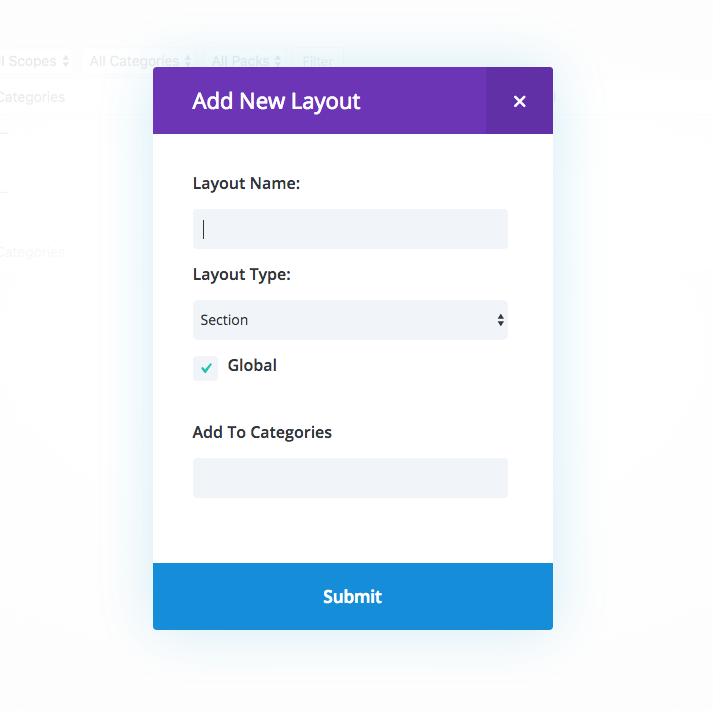
Do whatever you want with it.
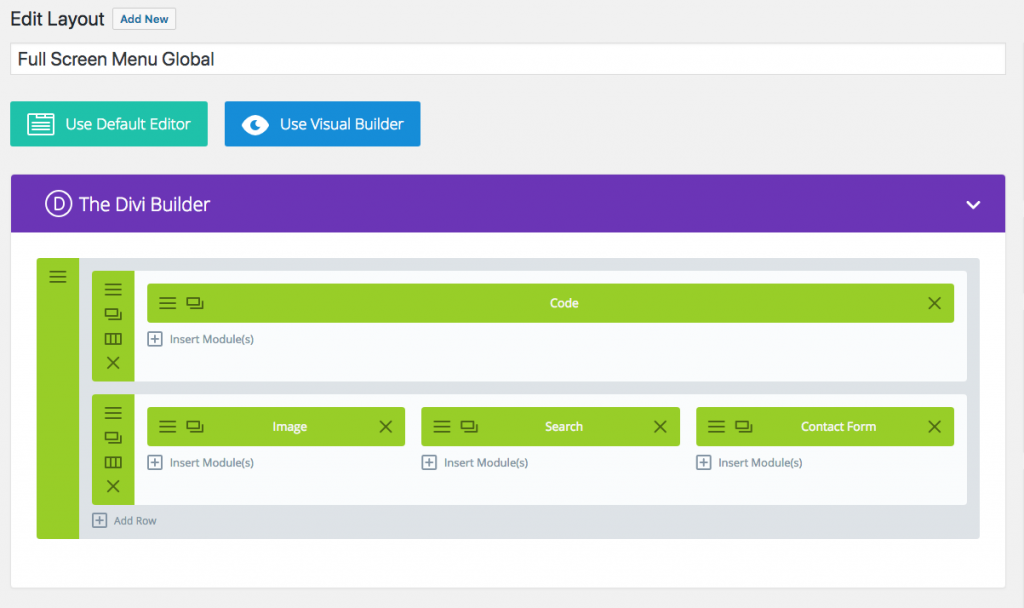
Save it, and go back to the library page, and you’ll see a shortcode for the section you just made.

Next..
edit the header
Around line 184, you’ll see this:
<div class="et_pb_fullscreen_nav_container">
<?php
	$slide_nav = '';
	$slide_menu_class = 'et_mobile_menu';

	$slide_nav = wp_nav_menu( array( 'theme_location' => 'primary-menu', 'container' => '', 'fallback_cb' => '', 'echo' => false, 'items_wrap' => '%3$s' ) );
	$slide_nav .= wp_nav_menu( array( 'theme_location' => 'secondary-menu', 'container' => '', 'fallback_cb' => '', 'echo' => false, 'items_wrap' => '%3$s' ) );
?>

<ul id="mobile_menu_slide" class="<?php echo esc_attr( $slide_menu_class ); ?>">

<?php
	if ( '' == $slide_nav ) :
?>
		<?php if ( 'on' == et_get_option( 'divi_home_link' ) ) { ?>
			<li <?php if ( is_home() ) echo( 'class="current_page_item"' ); ?>><a href="<?php echo esc_url( home_url( '/' ) ); ?>"><?php esc_html_e( 'Home', 'Divi' ); ?></a></li>
		<?php }; ?>

		<?php show_page_menu( $slide_menu_class, false, false ); ?>
		<?php show_categories_menu( $slide_menu_class, false ); ?>
<?php
	else :
		echo( $slide_nav );
	endif;
?>

</ul>
</div>
Delete everything from the opening php tag to the ul closing. So it’ll look like this:
<div class="et_pb_fullscreen_nav_container">

</div>
Then add the new shortcode so it’ll look like this:
<div class="et_pb_fullscreen_nav_container">
	<?php
		echo do_shortcode('[ai_layout_sc id="58"]');
	?>
</div>
(note: the id number inside the shortcode will be different because it’s your own section.)
… and…
You’re done! woot!
Hey, you wanna learn more about mobile responsiveness?
Click me to check out a cool course on how to make Divi more responsive
[sc name=”responsive-ad”]
Note: To take out the search bar on top of the full screen menu, check here:
About 10 lines starting from line 151, you’ll find:
<form role="search" method="get" class="et-search-form" action="<?php echo esc_url( home_url( '/' ) ); ?>"> <?php printf( '<input type="search" class="et-search-field" placeholder="%1$s" value="%2$s" name="s" title="%3$s" />', esc_attr__( 'Search …', 'Divi' ), get_search_query(), esc_attr__( 'Search for:', 'Divi' ) ); ?> <button type="submit" id="searchsubmit_header"></button> </form>
Take that part out, and you’re done.
[sc name=”learn css”]
Photo by Manu Franco on Unsplash


Richard says:
How did you get your Menu to look like this?
pim says:
How come you’re getting [AI_LAYOUT … instead of [DS_LAYOUT , like i do? i don’t get the DS to work