
Contact forms are one of the most important features of a website, and in this post, I’ll try to go over some styling tips concerning contact forms.
I recently saw a FB post asking what people thought an essential function of a website should include.
I think it’s the contact form. Nothing even comes close in my opinion.
Even landing pages with a “coming soon” banner have contact details. Take away every other function of a website. All you have left is…. a contact form.
So yes. Contact forms.
Introduction
My choice of contact form plugin is Contact Form 7.
I think it’s the best bare-bones stupidly well-functioning plugin there is.
It’s also free.
It also has a lot of addons available.
BUT it’s a bit tricky to style well.
[sc name=”cf7-ad”]
Warning: this is a looooong post. So I’ve separated it into 3 chapters. The list below is linked to the chapters.
Styling Contact forms
Styling a contact form comes in (I think) three major components.
1. The layout and its responsiveness
2. The fields and their micro-animations
3. The submit button and its macro-animation
Note: These bullet points are just for the styling aspect of a contact form, not the functions or the planning for maximizing lead generation. JUST the styling.
the layout
As for layouts, if you’re using something user-friendly like Gravity, Caldera, Ninja, Formidable, or Quform (or something similar with a drag and drop interface), then you would already have a pretty usable layout method. Most of those forms have their own way of making half-width or thirds columns. Which is great.
On mobile, they all stack well, so that’s also good.
However, they all share one important problem, they’re all slightly harder to style when you get to steps 2, and 3.
That’s, of course, because they do a good job on their own. They usually have their own stylesheets that dictate much of the look and feel and with a 2 or 3 columned row they simply stack on mobile, which is usually good enough.
If you’re using Contact Form 7, it’s a good idea to plan for responsiveness during the building process.
Some easy ways for coding this in HTML for Contact Forms 7 would look like this:
<div class="hole-form">
	<div class="one-row">
		<div class="one-field left">
			[shortcode for a field goes here]
			<!-- This shortcode would come from CF7 -->
		</div>
		<div class="one-field right">
			[another shortcode]
		</div>
	</div>
	<div class="one-row">
		<div class="one-field left">
			[a second row of fields]
		</div>
		<div class="one-field right">
			[also in the second row]
		</div>
	</div>
	<div class="one-row">
		<div class="one-field full">
			[shortcode for a message field can go here]
		</div>
	</div>
	<div class="one-row">
		<div class="one-field full">
			[shortcode for submit button]
		</div>
	</div>
</div>
Couple that with css like this:
.hole-form {
	width: 100%;
	/* change this to get a different sized form */
	display: inline-block;
	/* I like using inline block because it's easy to center */
}
.hole-form .one-row {
	width: 100%;
	overflow: hidden;
	/* if the divs inside are floated,
	then the height cancels out,
	so this helps the parent div enclose
	the floated divs inside */
}
.hole-form .one-row .one-field {
	margin: 5px 0px;
	/* Margin on top and bottom
	so the fields won't stick together */
}
.hole-form .one-row .one-field.left {
	width: 48%;
	/* not 50% so they won't stick together */
	float: left;
}
.hole-form .one-row .one-field.right {
	width: 48%;
	/* not 50% so they won't stick together */
 	float: right;
}
.hole-form .one-row .one-field.full {
	width: 100%;
 	float: none;
}
@media all and (max-width: 479px) {
	.hole-form .one-row .one-field.left,
	.hole-form .one-row .one-field.right {
		width: 100%;
		float: none;
	}
}
And you are ready to roll. It’ll look like this:
(note: there are a few different ways of achieving this,
like flexbox (with justify content, and flex wrap),
or tables (enclosing the rows in table rows and the fields in half-width divs),
or inline blocks (all divs are inline blocks and move around thusly)…
here, I’m using the classic approach of divs and floats. It’s a basic CSS method, and it’s very reliable and easy to understand.
I personally use flexbox, because.. I love flexbox. haha)
Here’s a course I made featuring a lot of flexbox:
[sc name=”responsive-ad”]
So, about styling these puppies, a couple of tips:
– Don’t place them over an image. Especially a busy one. Almost no amount of darkening/lightening of the background overlay is going to save the contact form. Seriously, don’t do it. Use that image somewhere else. Look down at your (paper) notebook/notepad. Are you writing over an image? Most likely not, right? Simple rule of thumb, if you can write over it with a pen, then ok, otherwise, avoid. Writing on a clean surface is much more user friendly than writing over an image. I don’t want to name names, or point fingers, but there are a lot of contact forms that really gave up on legibility.
Here, have a look.

Pretty hard to read/write, right?
Compare that to this (About 3% better than before):
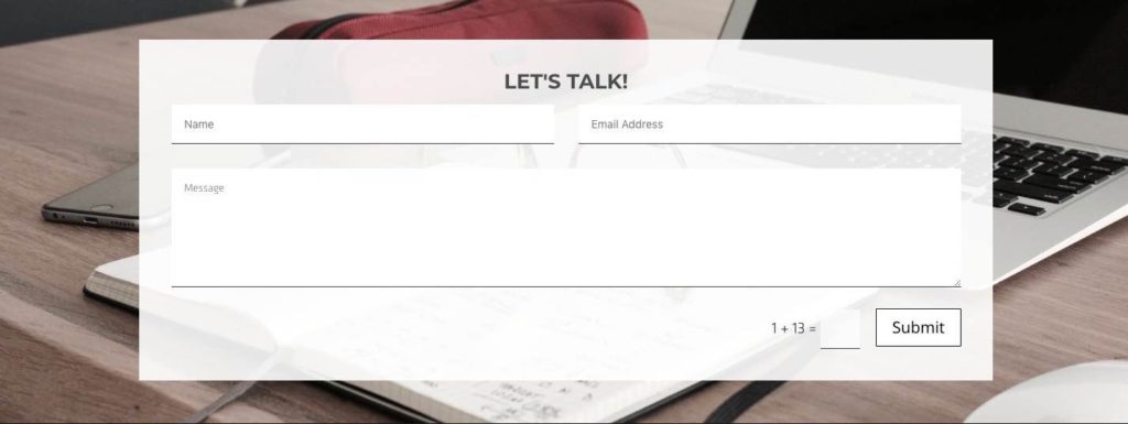
– Another thing that you don’t want is full-width contact forms. Try to go with a half-width form (or at least a 2/3 width). Even regular paragraph text is hard to read if it’s too stretched out horizontally, (Extra reading on this here and here.) This applies to the users’ typed content as well. If it’s too long horizontally across, then the eyes have trouble following the content.
Compare the above layout to this:
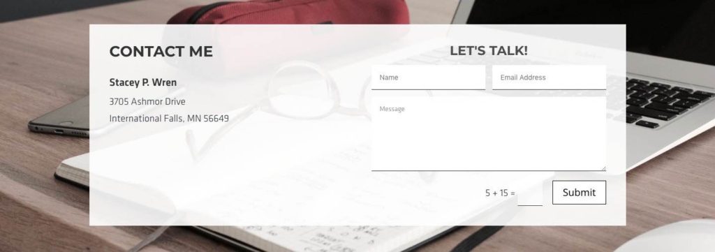
Now it’s easier to follow what you’re writing (and to proofread) through the line breaks.
However, I still think the background is a bit too busy, and I would like the “let’s talk” left aligned, plus, I prefer not to drop any opacity for the background (for better legibility) If I had to improve the above contact form section with three clicks, it would be background image, background opacity, and title alignment. So..

Also,
– Make sure the labels respond with the fields and move together. Also, I really suggest putting the label above the field. People read from top-down, so it’s natural. You’re not going to win any design awards by putting the label underneath. Usability is important.
Case Study
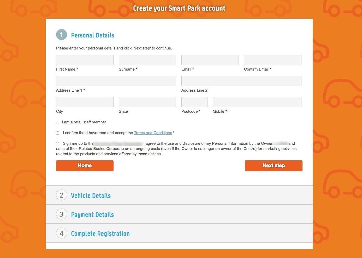
I usually don’t include real-life examples, but this website bamboozled me. I was trying to sign up, and I kept putting text in the wrong field. Ugh.
This input field does not look too bad on desktop, luckily, the form has a solid white background, so that part was good.
However, when you check it on mobile where everything stacks, the labels are under the fields.. giving you this:
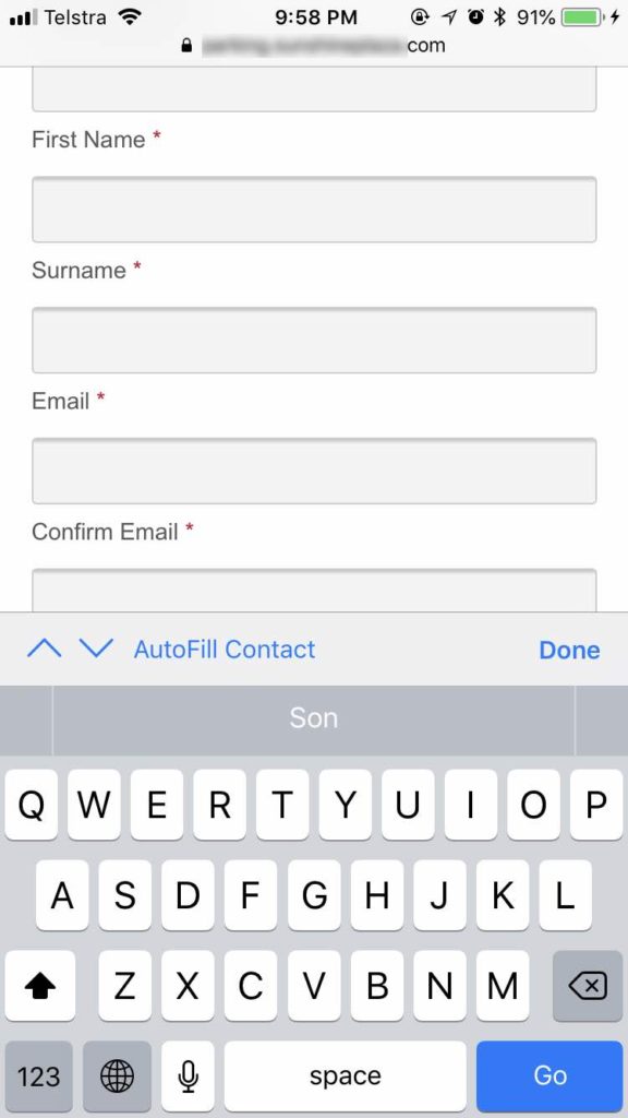
That is very confusing. It’s easy to get lost, and it’s easy to confuse which field is which.
Two reasons.
1. Scrolling and reading is top down, so you see the label after the field.
2. The spacing from a label to the next field is similar to the label to its field.
That website was one of the worst/most confusing input screens I’ve seen in a while. (Not the ugliest, there are plenty of those, but definitely the most confusing)
And another important thing about mobile we should always think about is that you need to think about the keyboard area. This leaves you with only a small area for text input. So instructions should be simple and direct.
Let’s move on to the next chapter.
=-=-=- Back to top – Table of contents -=-=-=
1. The layout and its responsiveness
2. The fields and their micro-animations
3. The submit button and its macro-animation
the fields
Most fields are just text input fields. You can be fancy and use number fields, date fields, and email fields, but except for the email field, there’s more hassle than convenience in many cases. ugh. I don’t like anything that’s a hassle. I have enough problems without contact forms adding to it.
Here is where the stying takes full effect. There are a lot of things you can do that don’t have to be overly funky, while making the form look good.
A couple of tips that I think helps:
– Keep it simple and easy on the eyes. You’re styling input fields, not eye-catching headlines. People are going to have to write on those fields. So nothing jarring, surprising, or hard to read.
– Color-wise, make sure there’s enough contrast, and it’s easy to read what you’re typing.
– Also, make sure it’s easy to tell which field the user is typing in, so we will use the :focus pseudo element to style this.
Let’s give this a crack with the CSS below.
.customclass input[type=text],
.customclass input[type=password],
.customclass input[type=tel],
.customclass input[type=email],
.customclass textarea,
.customclass select {
        width: 100%;
	margin: 0px 0px 0px 0px;
	border: 1px #222 solid;
	border-radius: 1px;
	padding: 10px 12px;
	background: #f5f5f5;
	font-family: Helvetica, Arial, sans-serif;
	color: #555;
	font-size: 18px;
	font-weight: 400;
	text-transform: none;
    -webkit-transition: all 0.5s ease-in-out;
    -moz-transition: all 0.5s ease-in-out;
    -o-transition: all 0.5s ease-in-out;
    -ms-transition: all 0.5s ease-in-out;
    transition: all 0.5s ease-in-out;
}
.customclass input[type=text]:focus,
.customclass input[type=password]:focus,
.customclass input[type=tel]:focus,
.customclass input[type=email]:focus,
.customclass textarea:focus  {
	border: 1px #f00 solid;
	background: #fff;
	color: #111;
    -webkit-transition: all 0.5s ease-in-out;
    -moz-transition: all 0.5s ease-in-out;
    -o-transition: all 0.5s ease-in-out;
    -ms-transition: all 0.5s ease-in-out;
    transition: all 0.5s ease-in-out;
}
You should probably change the .customclass to something else, or you can just put “customclass” over the form you want styled.
A good rule of thumb for styling these fields:
– Try to allow some padding so the text won’t feel claustrophobic.
– Also, try to keep the text size large enough that it’s easy for people to read what they’re typing.
=-=-=- Back to top – Table of contents -=-=-=
1. The layout and its responsiveness
2. The fields and their micro-animations
3. The submit button and its macro-animation
the button
The submit button is the last and most important step, right? Yes.
So, generally speaking, the submit button should be easily noticeable, and enticing. (Side not: The submit button most likely shouldn’t say “submit” – source it should probably say “send”, or some other action word.)
I’ve had a lot of contemplating on how to style the submit button, and here are my general rules of thumbs. (Thumbs? Thumb? Rules of thumb?)
– The mouse hover should be for the whole button.
So what I mean is this:
and not this:
The reason why I think this is important is because the action of submitting works throughout the whole button. So the part that can cause the action should respond. All of it. If it reacts, it should be actionable.
For the sake of completion, here’s the css I’m using:
a.fun-button {
	display: inline-block;
	cursor: pointer;
	font-family: 'Libre Franklin';
	font-size: .8rem;
	font-weight: 700;
	padding: .5rem 1rem;
	background: transparent;
	color: #d00 !important;
	text-transform: uppercase;
	border: #d00 solid 1px;
	border-radius: 1px;
}
a.the-whole-button:hover {
	background: #d00;
	color: white !important;
}
a.just-the-text:hover {
	color: black !important;
}
=-=-=- Back to top – Table of contents -=-=-=
1. The layout and its responsiveness
2. The fields and their micro-animations
3. The submit button and its macro-animation
Conclusion
So there you have it. The bare bones basics of styling contact forms.
[sc name=”cf7-ad”]
PS. I have not mentioned anything about SMTP settings, mailing services, MX servers, or the UX, UI, side of things, or anything on lead generation. I’ve had experience with all that, and my job does cover that side of web-related services, but, I have kept this post to strictly styling. I can write up some posts on adding functions to the contact forms, if you’d like, but for the record, I am not a fan of server-related issues and settings. No sireee.
[sc name=”learn css”]
Photo by Heather Shevlin on Unsplash
Photo by Dose Media on Unsplash