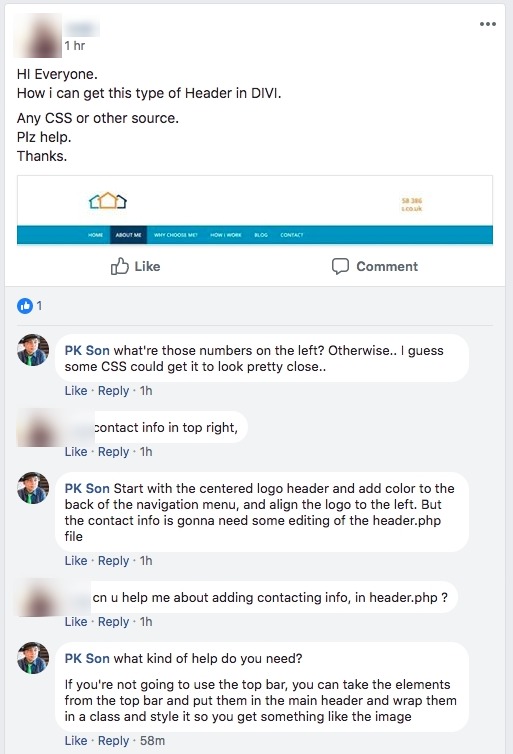
Hey guys, here’s a nice new header for you. Just follow through (or watch the video) the tutorial, and you’ll have a cool new header.
(PS. This could be a long running theme where I have different custom headers, let me know if you like that idea)
So, I was on Facebook browsing the groups when I stumbled upon this post. (It’s not that the person’s identity is supposed to be kept secret, when the person has also allowed me to use this tweak on my blog, I just want to keep things related to privacy safe.)

I was asked to edit the file directly.. and although I normally would charge for this when it’s a proper development, but I figured I could get it done in 5 minutes (In reality, it took 7 minutes) and I could save the file to make a post out of it. So I decided, why not.
The planning
The header.php file is going to be edited, so you need a child theme.
Click this text to go get a free child theme.
Alright, still here?
Cool.
Let’s proceed.
Here’s what we are going for:

We need to plan how it’s structured, so here we go:

Hope that helps.
the header file
In the header.php file, lines 61 to 78 contain the php code for retrieving and displaying the email and phone number. We’re going to use that. Also, we need to encase it in some divs.
So the php file is in the downloadable zip file. Plus the CSS.
Drop them in the right places
– php: overwrite the header.php in the child theme
– CSS: probably just copy paste the code in the theme options page.
To learn about CSS and/or responsiveness, check out a course I made by clicking this text!
.et_header_style_centered #main-header .the-upper-section {
	display: flex;
	justify-content: space-between;
	align-items: center;
}
.et_header_style_centered #main-header .the-upper-section .logo_container {
	text-align: left;
	width: 30%;
}
.et_header_style_centered #main-header .the-upper-section .contact-details-on-left #et-info #et-info-phone {
	display: block;
	text-align: left;
}
.et_header_style_centered #main-header .the-upper-section .contact-details-on-left #et-info #et-info-email {
	display: block;
}
.et_header_style_centered #main-header .themenubackground {
        /* The color and paddings are styled here */
	background: #2ea3f2;
	padding-top: 22px;
}
.et_header_style_centered #main-header .themenubackground div#et-top-navigation {
	text-align: left;
}
If you have any questions feel free to ask or comment below!
Notice:
Please consider signing up for my newsletter for… two emails (at most) a month of news, updates, and special offers, including child themes and more courses. Sound interesting? The signup form is right here!
Version checked: 3.3.1, Oh yeah, how cool does the theme builder look? Excited?
Updates
I had a request for two things,
a. some additional responsive CSS, and
b. two phone numbers + email
So here they are:
To make the header shown above responsive, add this extra CSS:
@media all and (max-width: 980px) {
	.et_header_style_centered #main-header .the-upper-section .contact-details-on-left {
		width: 50%;
		margin-right: 24px;
	}
	.et_header_style_centered #main-header .the-upper-section .contact-details-on-left #et-info {
		display: flex;
		flex-wrap: wrap;
	}
	.et_header_style_centered #main-header .the-upper-section .contact-details-on-left #et-info #et-info-phone,
	.et_header_style_centered #main-header .the-upper-section .contact-details-on-left #et-info #et-info-phone2,
	.et_header_style_centered #main-header .the-upper-section .contact-details-on-left #et-info #et-info-email {
		font-size: 14px; /* Change the text size here */
	}
	.et_header_style_centered #main-header .themenubackground {
		background: transparent;
		padding-top: 0px;
		position: absolute;
		top: 10px;
		right: 0;
		left: 0;
		z-index: 998984979798;
	}
	.et_header_style_centered .et_mobile_menu {
		top: 60px; /* adjust this if needed */
	}
}
@media all and (max-width: 479px) {
	.et_header_style_centered #main-header .the-upper-section .logo_container {
		width: 50%;
	}
	.et_header_style_centered #main-header .the-upper-section .contact-details-on-left {
		display: none;
	}
	.et_header_style_centered #et_mobile_nav_menu {
		margin-top: 20px; /* adjust this if needed */
	}
}
Just drop that in there, and hopefully it’ll be ok. (let me know if you have problems)
Note: the phone number and emails are hidden on mobile. The header structure has changed too much at this stage. I could make another header that is coded differently, but It looks nice as is, so I’ll leave it alone for now.
Here’s the header file that has space for two phone numbers. (click me to download the zip) Just make sure you find the text “phonenumber” and change it to the second phone number. Then add this CSS.
#et-info-phone2 {
	margin-right: 13px;
}
#et-info-phone2:before {
    position: relative;
    top: 2px;
    margin-right: 2px;
    content: "\e090";
    font-family: ETmodules!important;
}
.et_header_style_centered #main-header .the-upper-section .contact-details-on-left #et-info #et-info-phone2 {
	display: block;
	text-align: left;
}
[sc name=”learn css”]
[sc name=”responsive-ad”]
Photo by Chantal & Ole on Unsplash


Adam says:
This is perfect, thank you for the detailed breakdown. I do feel that Divi headers do lack serious appeal when it comes down to displaying important and credible information in the header (phone, email, social etc).
Can you confirm if this works with Divi’s Centered Header too?
Thank you once again!
PK says:
Hi Adam, unfortunately, this alteration was made with the default header in mind, so it won’t work with the centered header.
If you have a mockup of what you would like to see, shoot me an email, and I could try to create it in a post sometime. 🙂
Amanda Lucas says:
Love it PK, thanks a lot
PK says:
That’s great! You’re welcome!
steven says:
Do I like the idea to have different custom headers by follwing your tutorials?
I LOVE it 😉
Very cool stuff! Keep ’em coming!
PK says:
Cool! Thanks Steven! If you have any header inspirations, leave a link!