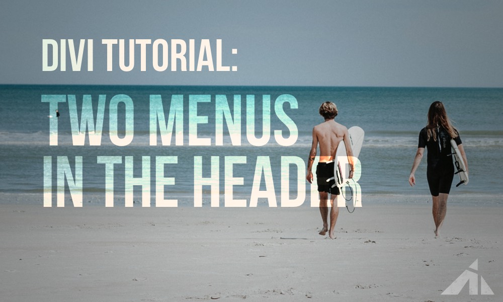
Here’s a neat way to getting two menus to work in the header. One regular, and one mobile dropdown. A friend asked if I could make something like a layout from a website he thought was pretty cool. (Leslie, from https://agirlandhermac.design/ to properly credit the inspiration) So I tried a couple of different ways of achieving this.
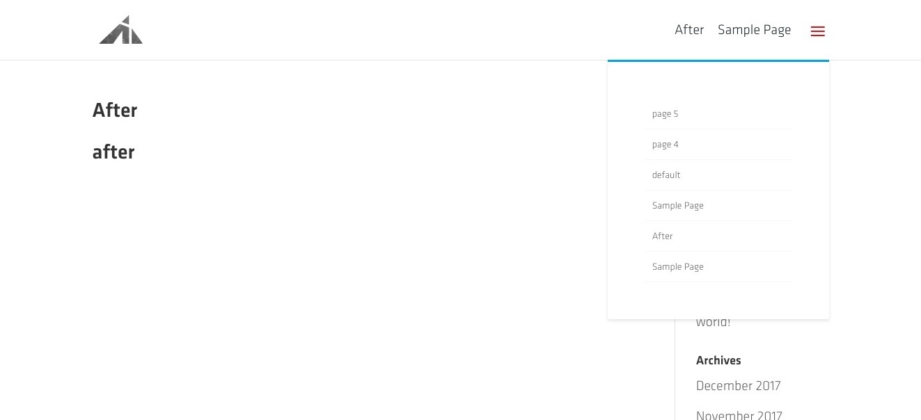
Here’s what it looks like:
I decided to make this tutorial with a solution that:
a. stuck with Divi’s assets and behavior as much as possible
b. used the newly updated Divi header file. (There aren’t any cosmetic changes, but the structure has changed slightly, making a huge difference in editing the php file)
Before we start
The header.php file is going to be edited, so you need a child theme.
Click this text to go get a free child theme.
Still here? Coolio.
The Video
Watching the video will probably help a bit:
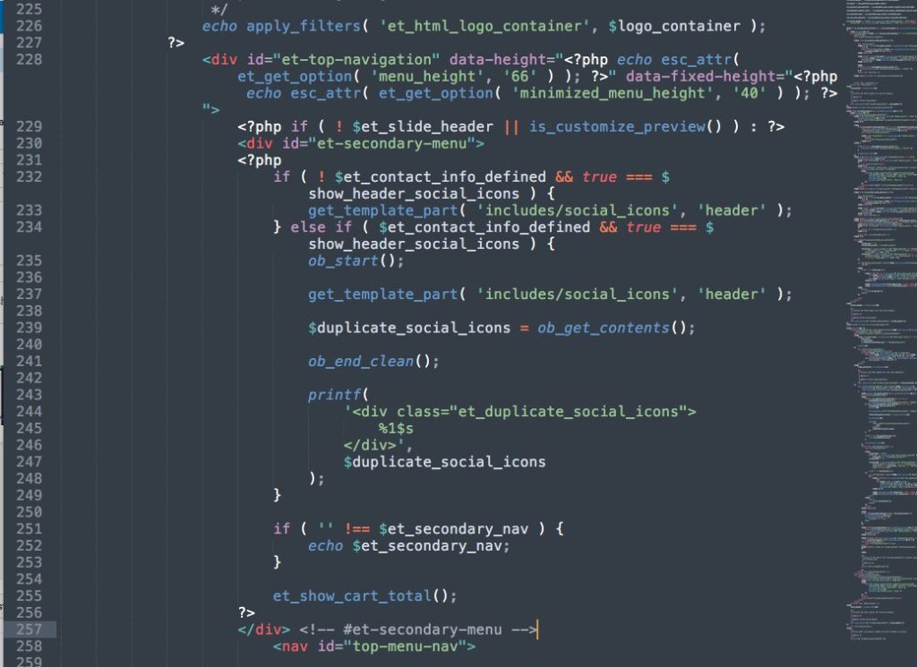
The php edit
So, open the header.php file (either in wp-admin > Appearance > editor > header.php, or, through FTP in a text editor) and locate the secondary menu. It’ll be in line 80.
The div should look like this:
<div id="et-secondary-menu">
    There will be a bunch of PHP code here.
    I can't paste it here because it causes problems,
    but just select the code all the way down to...
</div> <!-- #et-secondary-menu -->
Take that whole div and move it all the way down to where the
<nav id="top-menu-nav">
is. You’re going to drop the copied code right above that nav element.
So it’ll look like this:
The setup
Now the text menu will be the secondary menu, and the hamburger will be the primary menu.
Assign your menus, and then go on to style them in the next section. woot
The style edit
Add this CSS snippet anywhere you normally add extra CSS.
(Divi theme options, theme customizer > custom CSS, child theme stylesheet, etc)
#top-header {
	display: none;
}
#top-menu.nav {
	display: none;
}
.et_fixed_nav #et-top-navigation {
	display: flex;
}
#et-secondary-menu {
	margin-right: 22px;
}
/* This is where you style the text menu */
#et-info, #et-secondary-menu > ul > li a {
	font-size: 18px;
	color: #444;
}
@media all and (min-width: 981px) {
	#et_mobile_nav_menu {
		display: block;
	}
	.et_mobile_menu {
		width: 30%;
		right: 0;
		left: auto;
		padding: 20px;
	}
	/* These guys are hidden on desktop to avoid double-upping menu items */
	.menu-item-118,
	.menu-item-119 {
		display: none;
	}
}
and you’re done!
Note: Make sure you hide the doubled menu items.
Also, if you want to change the hamburger icon, click this:
If you can’t be bothered to do any of this, then download this file:
and unzip. You’ll see header.php and untitled.css
copy header.php into the child theme’s root folder, and open the css file, copy the css and drop it into a custom css field. (Theme options > custom CSS)
Edit some of the CSS to fit what you want, and you’re done!
[sc name=”learn css”]
[sc name=”responsive-ad”]
Other header tutorials


Photo by Seth Doyle on Unsplash

David says:
Hi,
I downloaded the files you provided, swapped your header.php with mine, copied css in theme options and created the menu items.
The hamburger menu shows on the left of the text menu and the hamburger burger menu doesn’t line up with the text menu either.
PK says:
Hi could you post a URL please? Or feel free to email me through this page http://almostinevitable.com/contact-me/
Thanks!
David says:
my url is davidreidcreative.co
PK says:
I just replied to your email.
The .et_fixed_nav in the CSS kicks in when the top header is fixed via Divi settings.
You can fix the header, or take that part out to get the intended result.
Thanks!
Kim Adams says:
I tried to do this 3 times. Followed your video to a T and I’m still not seeing the other menu items as text! Any ideas??
PK says:
Hi, could you send me an email with the URL so I can check? My email is in the author box.
Thanks!
Kim Adams says:
Aloha! Sent you an email. Thank you!