Right off the bat, let’s get this out of the way.
I’ve (almost) never seen a WIX website that I have NOT considered UGLY.
There. That’s about it.
Now I’ll try to explain why I think this is the case.
Disclaimer
I might inadvertently have to talk about good/bad design. Design CAN be subjective, so if you (or a friend) really likes a certain… look, then good on you. It’s not a problem at all. However, there are aspects of design that can be perceived as bad by the majority, or at least in terms of delivering its purpose effectively, making it slightly closer to being an objectively better design.
Also, (and this is important) in terms of providing a certain solution, there is an answer that may not be definitive or singular, but objectively good or bad.
For example, if some text is laid out in a certain way, then it’s (pretty much) not hard to determine whether it’s good or bad. It might not be the only answer (of course) but it can be judged on whether it serves its purpose or not.
I will try to stick to those types of solutions. The ones that have a relatively clearer good/bad answer. So when I say “good/bad design” I’m trying to go with the consensus of industry professionals.
The competition
The digital web creative world is in perpetual competition and innovation.
WordPress, Drupal, Joomla, SMF, phpBB, Ghost, Muse, Magento, Prestashop, Open Cart, Shopify, WIX, Squarespace, Webflow, Weebly .. and straight up custom code. Even hosting companies provide their own proprietary page builders now.
That’s just a handful of the thousands of web creation tools out there competing for more marketshare. There are also dozens of new modern languages that compile into standard HTML, CSS, and JS. (HAML, Babel, SCSS, SASS, LESS, and the thousands of Javascript libraries) So suffice to say, there’s no shortage of options.
Is that overwhelming? Yes. It is VERY overwhelming.
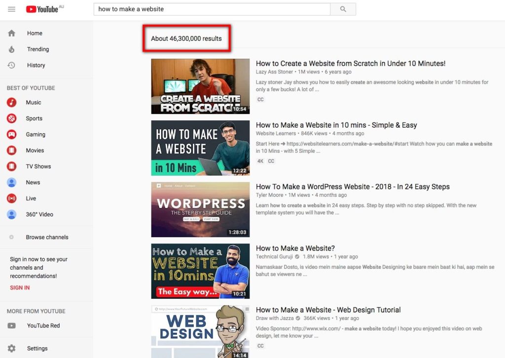
A YouTube search gives us a bit more than a Brooklyn Nine-Nine binge. (nine nine!)

And that’s the problem we face as developers, designers, and even as a client.
It’s overwhelming to decide which path to take.
Here’s another interesting aspect to think about.
How much?
How much does a website cost?
So, if someone asked me for a simple-but-professional overview of what a website package can include, here’s a list of items that would cost monies.
- Domain
- Hosting
- Mail server (depending on how it’s going to be used)
- Designing the proof (Yes, you need a proper proof/mockup)
- Development & testing
- SEO and analytics
- Maintenance
That’s a lot of items, and it is also…. you guessed it, overwhelming.
Oh, by the way, this can cost anywhere between $30 to $1,000,000 (woot!) depending on the scope and talent involved. (More realistically, between $300 – $20,000? Personally, I’ve only made websites ranging from $200 to $15,000.)
So yeah, overwhelming and way too many factors.
WAY too many factors.
What’s next?
So let’s think about the hypothetical client. They want a “simple” website for their business.
(I put quotation marks on simple because nothing is simple, regardless of what they think haha)
They talk to a couple of creative agencies, and they get some quotes.
They say, “Yikes! All this for such a simple website?
I’ll get back to you on that!
hmmm…
Let’s have a look around..”
Now they start their research.
One option
Some clients end up saying,
“I have a nephew who’s made a website before.
He says it’s not too hard.
I’ll ask him!”

Note: I’ve seen this happen many times, and to be fair, I’ve seen a passable website or two. Good on the kid for swapping out some text and images in the demo layout on a Themeforest WP theme. Frankly, swapping out demo content is a much better solution than “custom design” in most cases that involve amateurs and (sadly) even some/many “professionals.”
Most of the time, the problems start whenever there’s ANYTHING that deviates from the demo content. It starts to fall apart very quickly. It’s like working with wet boxes.
The reason would be that the person making the website doesn’t know enough about actually making websites using the chosen platform, and more often than not, doesn’t know much about design either, so they are oblivious to the bad (awful) choices made throughout the customization process.
The result: A wonky website that sort-of works… sometimes.
With a lot of gaps,
text-aligns all over the place,
EVERYTHING animates,
blurbs, blurbs, blurbs, blurbs, blurb blurb blurb,
inconsistent margins,
inconsistent typography,
inconsistent colors,
distracting backgrounds on ineligible text… and then, since it was ineligible, a translucent background is added, solved,
…
you get the idea.
(Some characteristics: if the kid was really DIY, it might even have 2-3 different page builders, 2-3 different contact form plugins… basically 2-3 plugins for every function, about 10 different themes installed, and sometimes has the child theme installed, but not activated.)
Another option…
Employing a proper web designer and then developer will set the client back quite a bit, so the potential client opts to find different options.
They Google around a bit… (“I’m doing research about how to make a website myself, look at me!”)
Read some posts on the pros and cons of different platforms…
Get enticed about the DIY aspect and the simplicity of WIX…
And they go check it out…

“OOOOH free!
Hey this is… hard… no.. wait… just change the text here… got it! Oh wow this is easy!”

A wonky website that sort-of works… sometimes.
With a lot of gaps,
text-aligns all over the place,
EVERYTHING animates,
blurbs, blurbs, blurbs, blurbs, blurb blurb blurb,
inconsistent margins,
inconsistent typography,
inconsistent colors,
distracting backgrounds on ineligible text… and then, since it was ineligible, a translucent background is added, solved,
…
you get the idea.
Wonderful!

You know what… I need to add this.. one thing…

A wonky website that is somehow even worse now.

With a lot more gaps,
text-aligns all over the place (including a lot of justified paragraphs),
MOAR things are animated,
blurbs, blurbs, blurbs, blurbs, blurb blurb blurb, blurbs, blurbs, blurbs, blurbs, blurbs, blurbs, blurbs, blurbs, blurbs, blurbs, blurbs, blurbs, more blurbs,
worse margins,
more fonts,
more colors,
starbursts,
banners,
and larger jpg logos everywhere
…
you get the idea.
Perfect!
It’s usually really really really ugly. Which is why I haven’t seen many “presentable” WIX websites.
The reason? because people DIY it. People with.. unfortunately, bad taste and/or lack of basic design rules-of-thumb.
“Hey, but aesthetics and taste are subjective!”
Yes it is. There are many ways to design something that looks good.
There are many many more ways to design something that looks really bad.
If you gather a whole bunch of professionally trained designers, and show them a wide range of designs, they might not always agree on what is considered good design, but I can guarantee that the bad ones will almost always be unanimous.
So anyways, that’s how and why WIX websites are so ugly.
(Simply put, it’s because making websites are overwhelming.)
and yes, I’ve tried WIX.
http://almostinevitable.wixsite.com/templates
That link is a free WIX page. Yeah, I gave it a try. Just to make sure.
It was painful. I do not care for the “friendly” interface at all.
the difference
So… What is the main difference between WIX and.. say, WordPress?
WIX is easier for people who want to just get started on their own. However they will most likely regret it later down the road when they want to do… well.. anything, frankly.
WordPress is slightly harder to set up than WIX, and slightly harder to get it to work properly… and much much harder to do things properly. However, it’s a proper CMS that’s very mature, and very well supported by many of the world’s developers.
There are (too) many professional WordPress developers and web designers who use WordPress.
There are (close to) no professional WIX developers and web designers who use WIX.
There are many companies that develop plugins and themes for WordPress that help its advancement.
There are (close to) no third party companies that develop anything for WIX. WIX is its own company.
I can go on but I won’t.
Simply put, WIX is useful for… almost nothing.
If you want a website, learn WordPress, or hire a web designer, and professional WP developer.
(or some other CMS or custom built, just not WIX. WIX is probably the worst choice you could make concerning web construction)
Note:
This is not to say that hiring a “professional” always ensures best results, far from it, I’ve seen way too many UGLY websites done by a paid professional. Just pour-bleach-on-the-screen-make-it-go-away-please level ugly.
How do those people get paid? Why do they get paid?
How do they even get their clients? What kind of client okays that shit?
Seriously? What’s going on?
Anyways.. kudos to them for making a business out of it.
No, seriously, I’m appalled at the aesthetics, but impressed at the marketing. There’s always something to learn from everyone.
Update
It has been brought to my attention that WIX is trying to prove that their platform can actually provide a competent level of SEO.
This website https://www.wixseohaters.com/ is competing against WIX. They’re a digital marketing strategy company by the name of Liquid Interactive, and I wish them the best.
Because… I hope WIX loses. Their “battle/competition” website has a CTA button in the hero section that says “meet the competitors” and the button doesn’t even link to anything. I don’t want to link to their stupid page, so just add /seo-battle/ to the end of their domain for the url.
Oh, and since it’s WIX, you can bet it’s not responsive.

-> That’s not a crop, that’s what happens to the stupid website on resize.
hahahahahahahahahahahahahaha
Oh seriously.. come on…
PS. For anyone who wanted to say “but you haven’t tried WIX, it’s actually really good,” ugh. Yes, I’ve tried WIX. Not a lot, granted, but the reason is because it was so bad. UGH. It’s worse than most WP visual builders, but I have a very low opinion of visual builders anyway, and WIX is one of the worst that I’ve used. Except for having Avenir. That much I praise WIX. I love Avenir. As an aside, Squarespace has Futura. Nice. Good for them having ONE redeeming point. (Actually Squarespace usually has better looking websites than WIX. There’s no free tier for SS so I haven’t tried it, but it could be that they have stricter templates, so less freedom for the users.)
PPS. So basically, because I think making websites are overwhelming (and sometimes expensive), WIX has a market. WIX sucks for anything/everything (including SEO) so I think people in the web creative industry should find ways to market themselves in a way that does not seem overwhelming. That’s basically what I was trying to get at.
Photo by Johny Goerend on Unsplash
There are also some Spongebob images I found on the internet. I am not sure how the crediting for this works…


