
Tell me if you’ve seen something like this before:
Now…
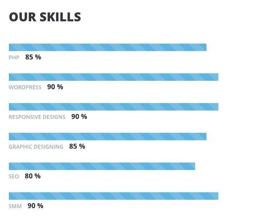
Please tell me what the missing 10% on the WordPress bar means… Does it mean this person can only finish up to 90% of all WordPress projects? or knows 90% of all the WP functions?
What does the 10% of the missing responsive design mean? Only 90% of the websites are responsive? Can edit only 90% of the websites to be responsive?
What about the 20% of the SEO that’s missing? “I can get you to the front page, but not to the top?” “I know a little bit, but not enough..?”
What is the missing 15% of graphic design supposed to mean? “I can design.. but not enough to win awards?”
Seriously WTF is the point of using bar graphs to show skill?
I’ve seen many websites with this in their “About” pages.
I’ve seen people’s resume’s with this in it.
I really don’t get it.
Here’s why I think this is a STOOPID idea.
That’s not how graphs work
This is probably the biggest problem I have of this ridiculous practice.
There’s no definitive measurement of what 100% means. This is a problem because… A unit on a graph should mean something.
This stupid bar graph does not mean anything. It’s an arbitrary scale of what the person thinks is warlock lvl 69.
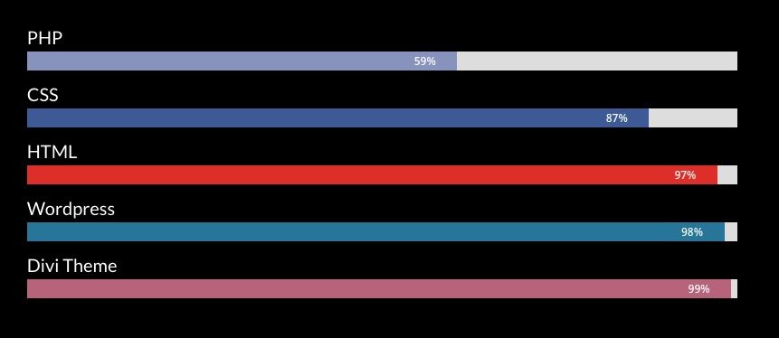
(Why even list PHP? 59% is a very specific number, too. 87% of CSS, but 97% of HTML. Wow. 98% of WordPress? Really? So this person knows ALL OF THE THINGS?? and 99% Divi?? Is this person better than the company with the first graph? I personally think they’re both crap.)
Which brings us to…
It’s not indicative of any ACTUAL skill
At best, it’s just a personal projection of how each skill compares against each other.
Again, without any objective scale, this is meaningless.
Even the totally arbitrary scale of “I can do what I want with this tool” is not an accurate measurement of proficiency.
Everyone’s level of “proficiency” is different.
This stupid measurement makes no sense, and doesn’t show or prove anything.
It’s not even a good marketing tool
Let’s say you go to a website and see 80% SEO, 90% design (WTF does 90% design even mean?) and 70% HTML.
What would you think?
“Hey why 80% SEO?” or “Wow this person must be great at design!”
Does it even make sense?
Does this help the potential client gain a better understanding of the person’s skills?
Probably not.
It breeds negativity
Think about this.. let’s say you’re a employer, or a client. So you’re someone assessing this stupid bar graph.
If you see 95% design -> “show me what you got” -> checks -> “really? you gave yourself a 95% for THAT?”
If you see 95% SEO -> “show me what you got” -> checks -> “really? you gave yourself a 95% for THAT?”
If you see 95% Photoshop -> “show me what you got” -> checks -> “really? you gave yourself a 95% for THAT?”
If you see 95% Illustrator -> “show me what you got” -> checks -> “really? you gave yourself a 95% for THAT?”
If you see 95% InDesign -> “show me what you got” -> checks -> “really? you gave yourself a 95% for THAT?”
If you see 95% PHP -> “show me what you got” -> checks -> “really? you gave yourself a 95% for THAT?”
If you see 95% HTML -> “show me what you got” -> checks -> “really? you gave yourself a 95% for THAT?”
If you see 95% CSS -> “show me what you got” -> checks -> “really? you gave yourself a 95% for THAT?”
If you see 95% Javascript -> “show me what you got” -> checks -> “really? you gave yourself a 95% for THAT?”
You get the idea…
It emphasizes the weaknesses
When things are so easily comparable, it not only shows the strengths, but accentuates the weaknesses.
That’s why it’s so stupid.
“Oh look, you only have 75% for social marketing. I won’t use you for that then.”
and so on…
There’s nothing good that I can think of that can come from this nonsensical bar graph.
Concession
This is the best argument I’ve seen on this useless practice:
“It’s easy to tell the difference between a person with
– 4/5 Graphic design
– 4/5 Illustrator
– 2/5 CSS
– 2/5 HTML
and a person with
– 4/5 Javascript
– 4/5 PHP
– 3/5 CSS
– 2/5 Photoshop”
This I can get behind… in the sense that this is what the person self-evaluates themselves as. They think they’re more comfortable with one area of work than the other, but that’s about it. There’s still no criteria as to what a 4/5 means. I’ve seen plenty of people who fancy themselves as one thing, but fails miserably in the results. Seriously delusional people. So a 4/5 or a 2/5 has not much difference in practice.
So we’re back to square one.
Conclusion
Look, I get it that it adds some animation to the webpage. And the bars when colored according to the branding might look nice. But showing a “skillset” with percentages or numbers is not a good idea. It makes no sense. It’s stupid.
some alternative suggestions
Try these ideas instead.
If you really want to use the bar graphs, use it for instances where you actually do need a bar graph like these instances:
– 56% of browser market share is Chrome. (source)
– With 22.9%, League of Legends is the most popular PC game. (source)
– In a 2012 Citrix survey, 51% of Americans think that stormy weather affects cloud computing. (source)
(pie charts work too, but pie charts are harder to make on web pages, and they’re harder to compare different values in some cases.)
If you really want to list your skills:
– Try adding tags to your portfolio pages and adding the linked tags to the skill list, so anyone who wants to see the works done with a specific tool or skill can see the projects done with that particular skill.
– Try describing what you did with a particular skill/tool in a project.
– Try listing the skills, and how long you’ve worked with them in a professional environment.
Also…
“What do I do with the bar graph animation then????”
Try something like this: http://almostinevitable.com/divi-tutorial-a-cool-animated-divider/
Image Credits:
pexels.com/photo/close-up-of-computer-keyboard-257949
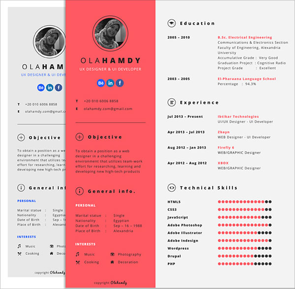
designbolts.com/2014/08/08/10-best-free-resume-cv-templates-in-ai-indesign-psd-formats